︎PROJECT:
︎ROLE:
RETURNLY RETURN CENTER DESIGN SYSTEM FOUNDATIONS
︎ROLE:
BRAND DESIGN
VISUAL DESIGN
CONTEXT
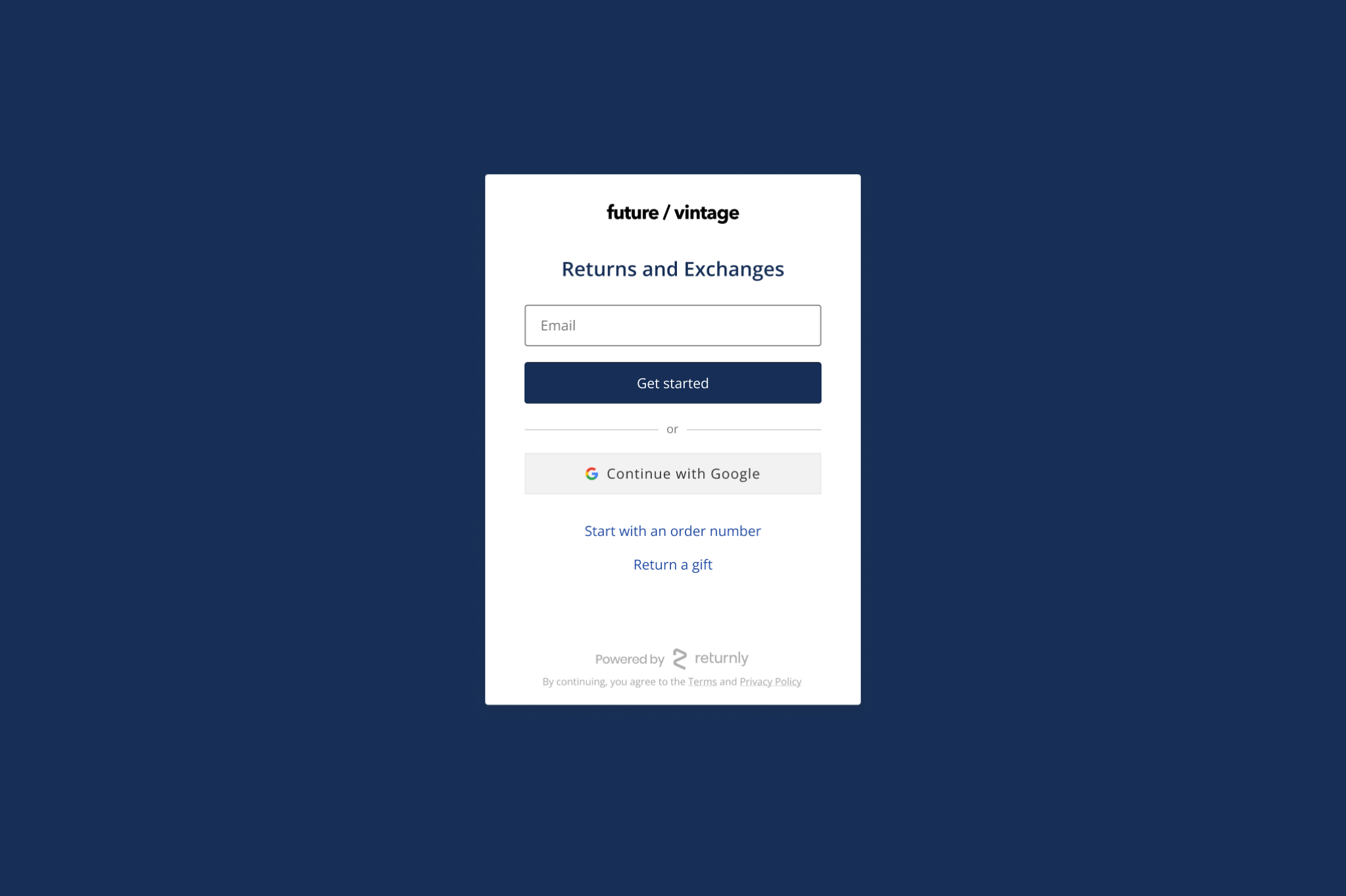
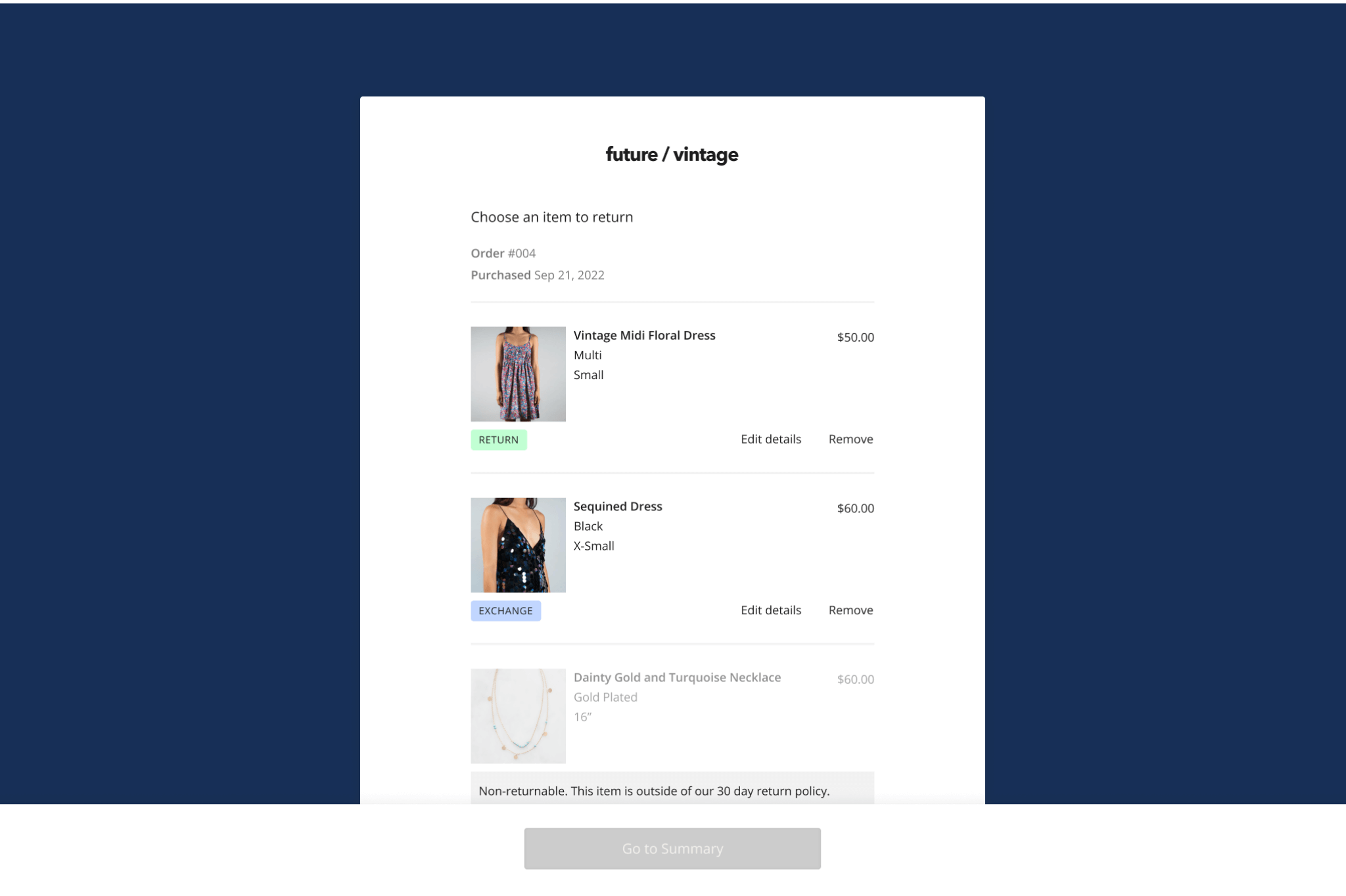
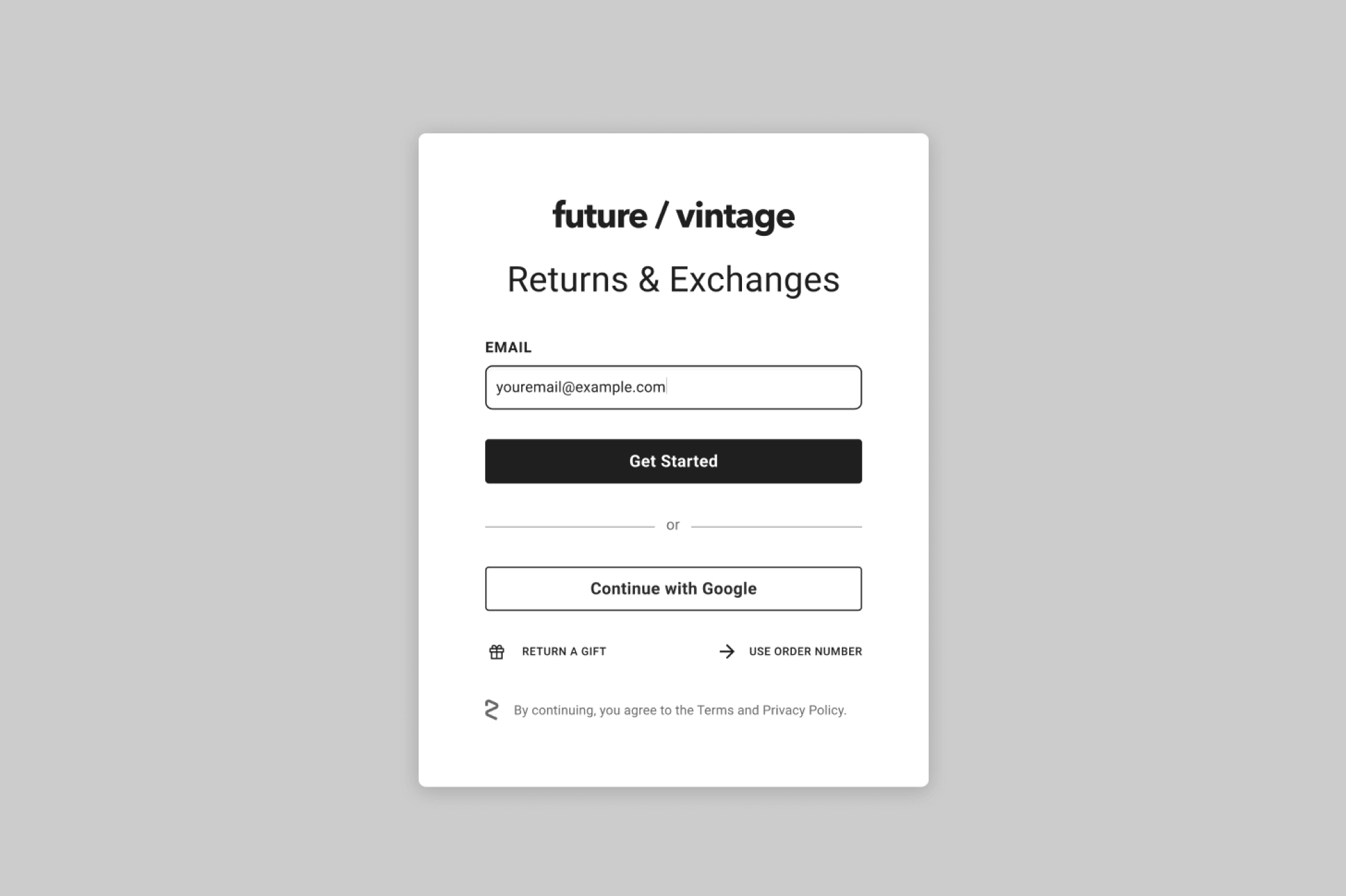
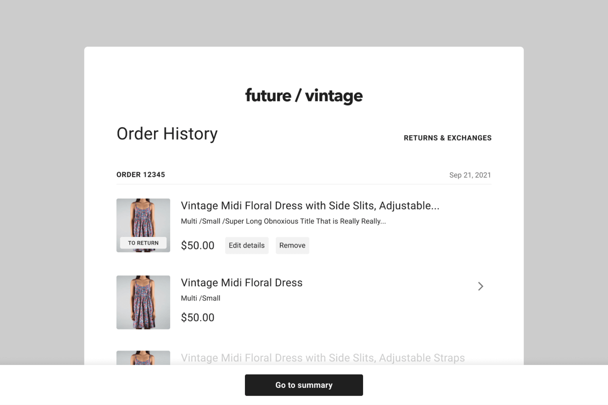
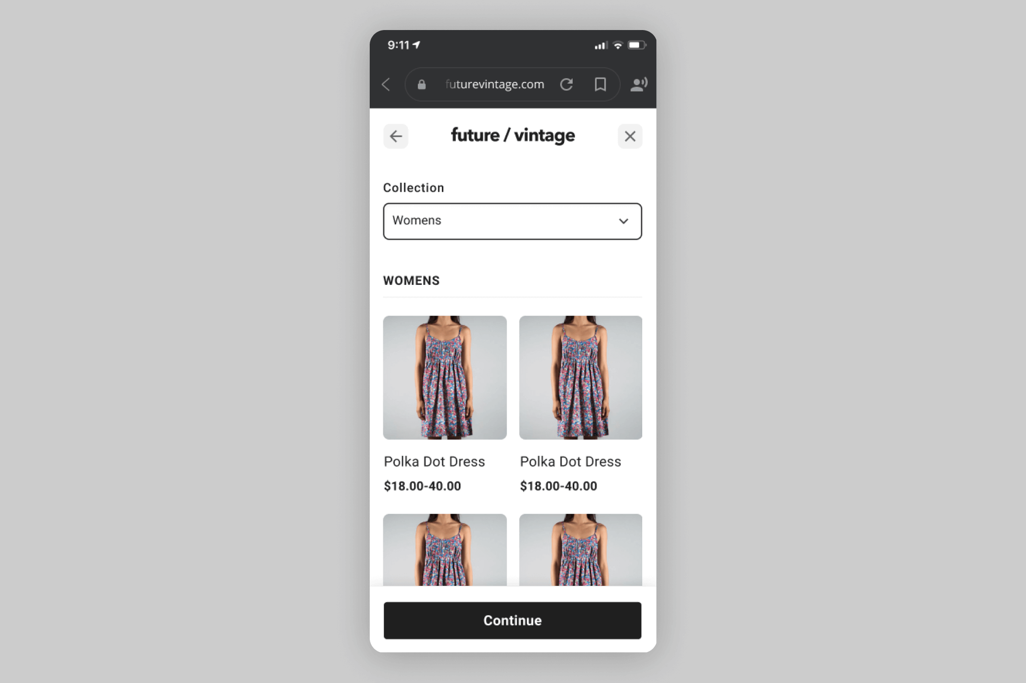
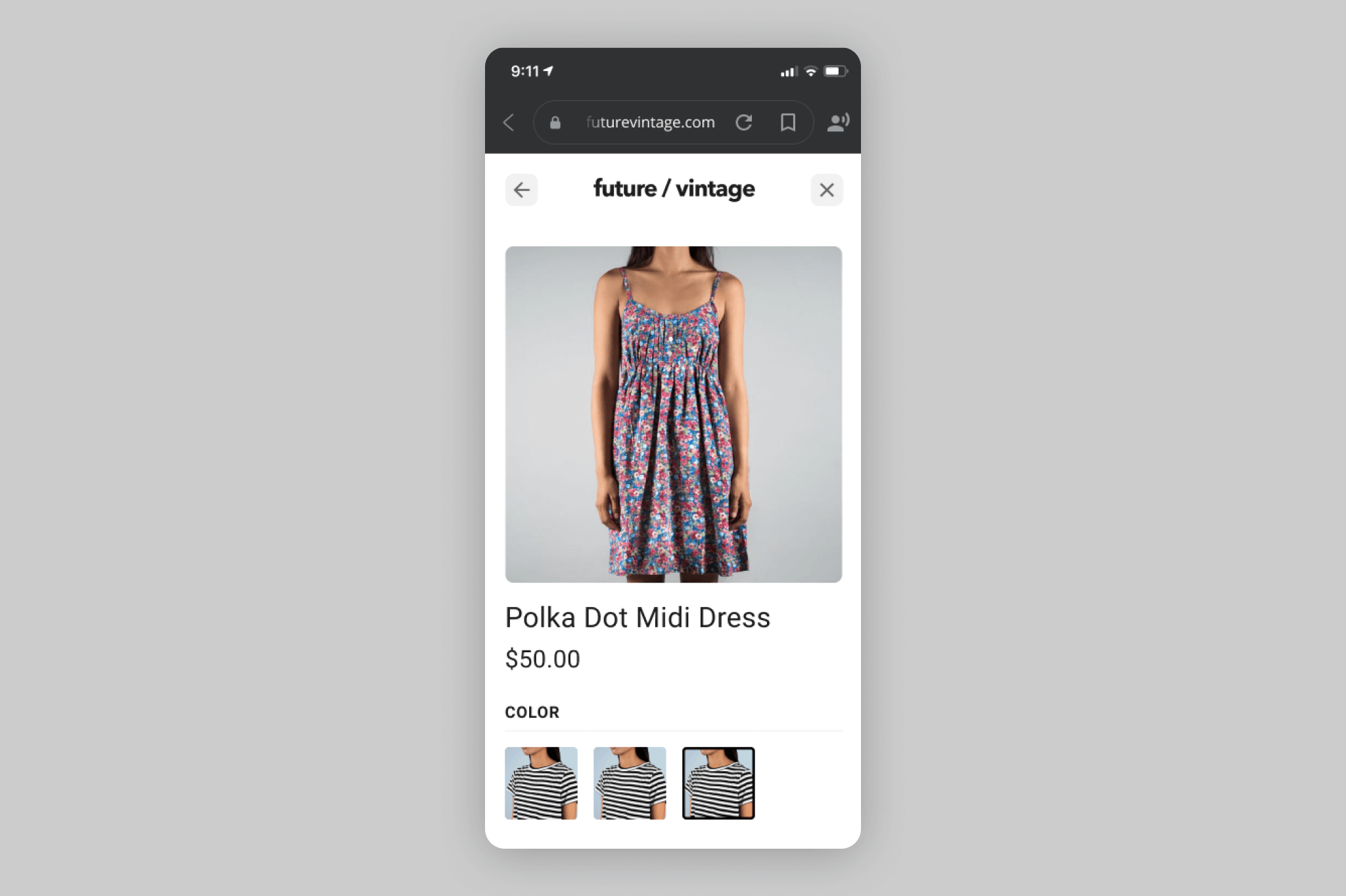
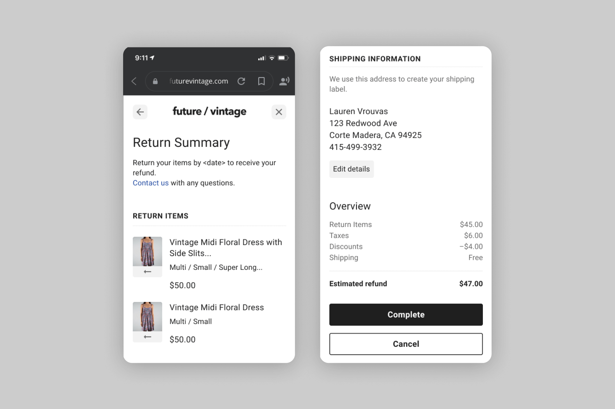
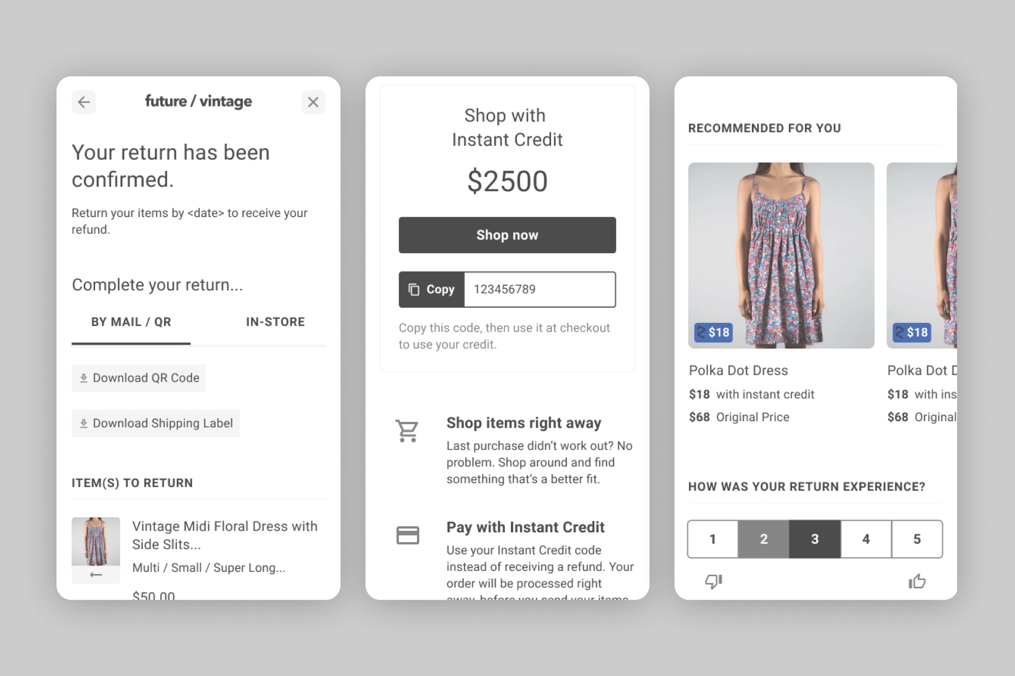
Returnly is a returns solution that allows shoppers to place a return order even before their return item is sent back and processed. Merchants who use Returnly can customize their shopper-facing Return Center, which shoppers then use to submit returns and exchanges. Shoppers can access a merchant’s Return Center directly from the merchant’s website or emails, and merchants prefer for the experience to look and feel like their own brand so that there is a seamless transition. For this reason, this surface area has minimal Returnly branding.
PROBLEM
The existing Return Center had a few key issues we wanted to address:
- It didn’t always feel cohesive
- It didn’t always follow best practices in readability
- It didn’t always follow best practices in accessibility
- It didn’t always make sense in terms of visual hierarchy
It also didn’t really have a true design system, so this was a good opportunity to not only reevaluate, but clearly define things for our expanding team.
GOALS
- Simplification of the Return Center through improved visual hierarchy, composition, accessibility, and consistency
- Establishment of Design System Foundations, including initial components and ultimately a pattern library
- External alignment with Product and Engineering on governance and rollout strategy
CONSTRAINTS
- Use existing Return Center as “functional wireframes”
- Keep functional/behavioral changes to a minimum
- Focus on visual refinement
- Consideration of merchant customizations (some components can be customized by merchants, while others maintain a default style)
- Evolve any behavioral/functional changes with product development to ensure testing and scope are aligned with product and engineering backlog
PROCESS
As with any project, the first step was research: in this case, it was a visual audit of our competitors’ return centers, coupled with an audit of the existing Return Center that highlighted areas of opportunity.
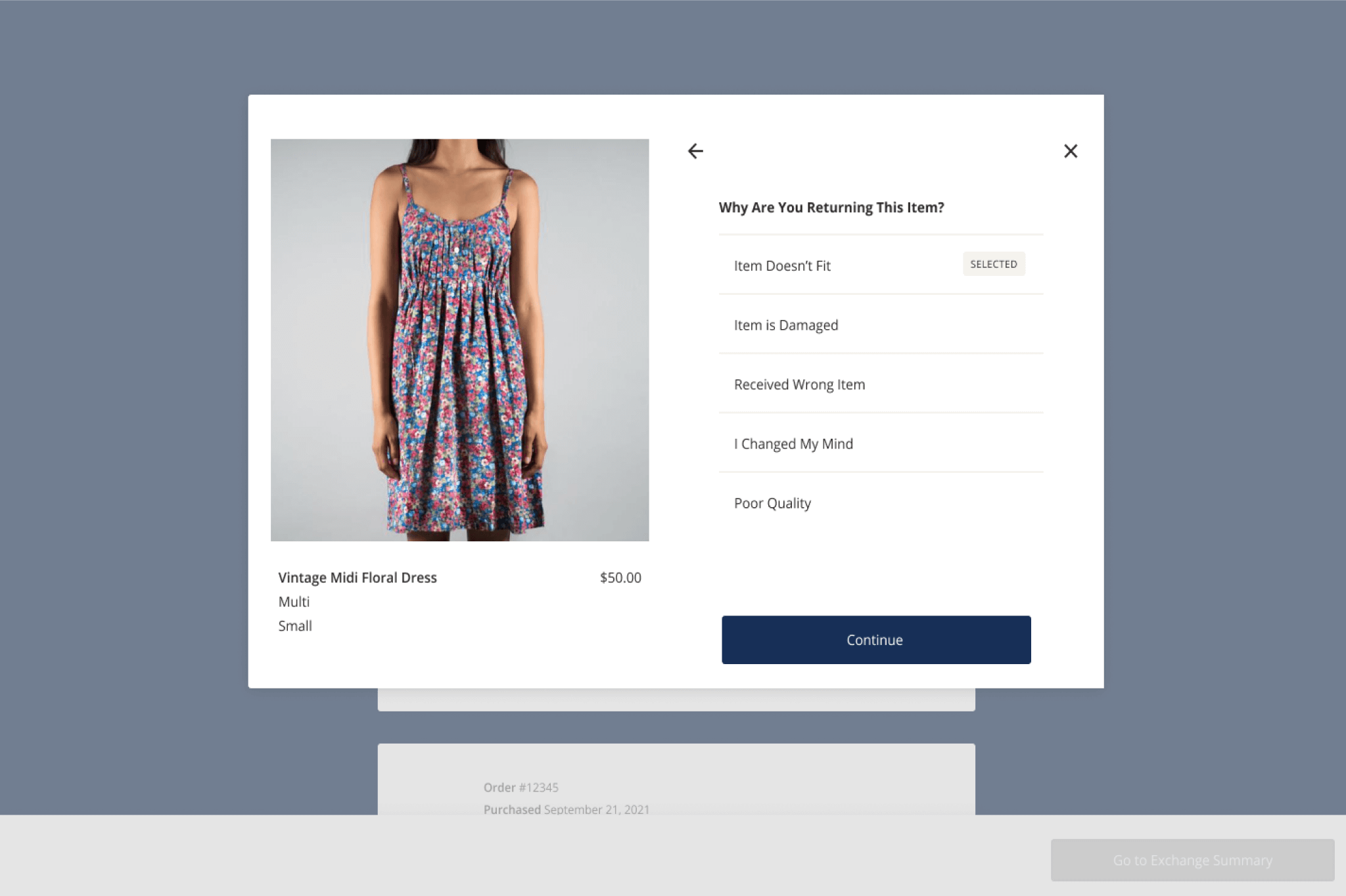
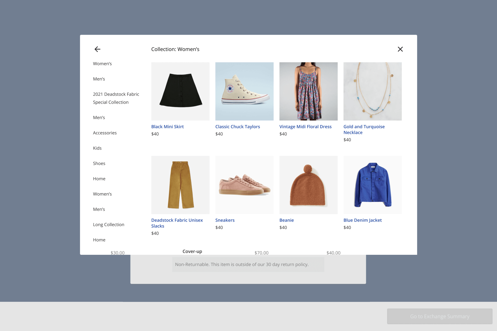
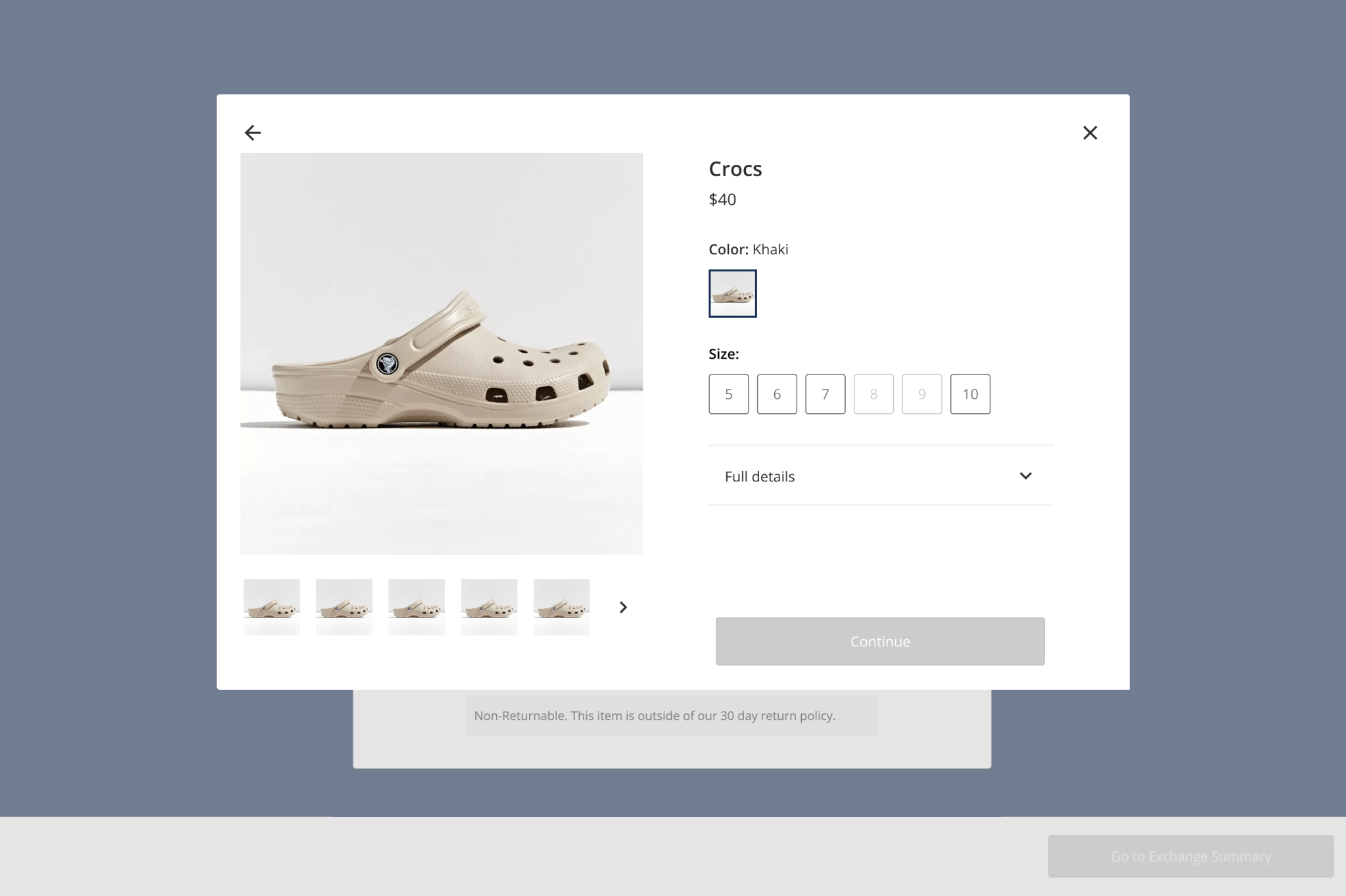
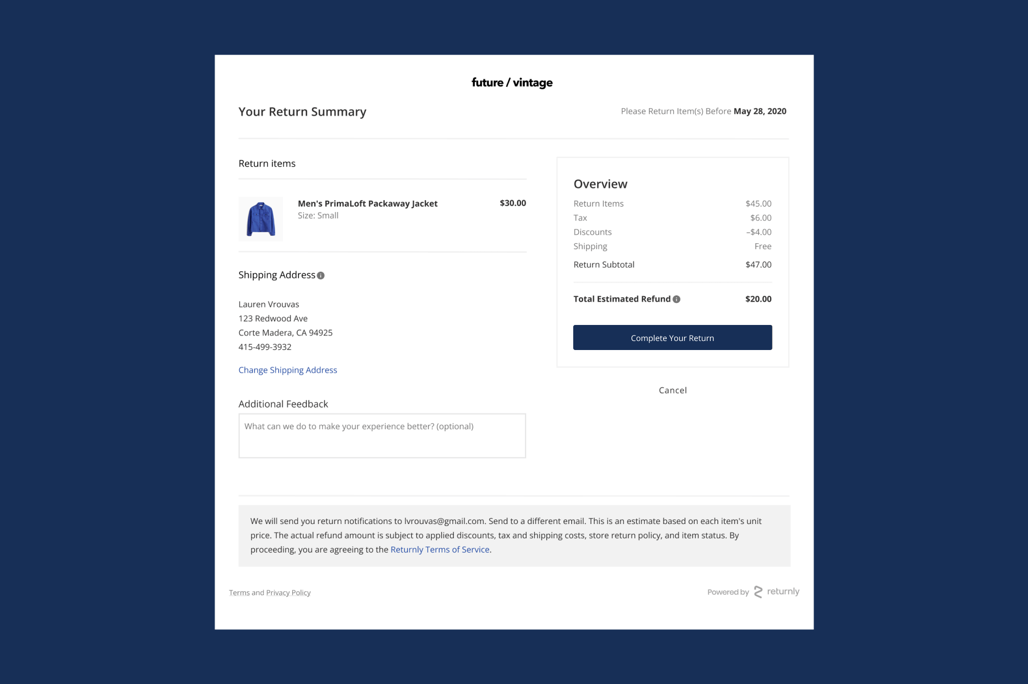
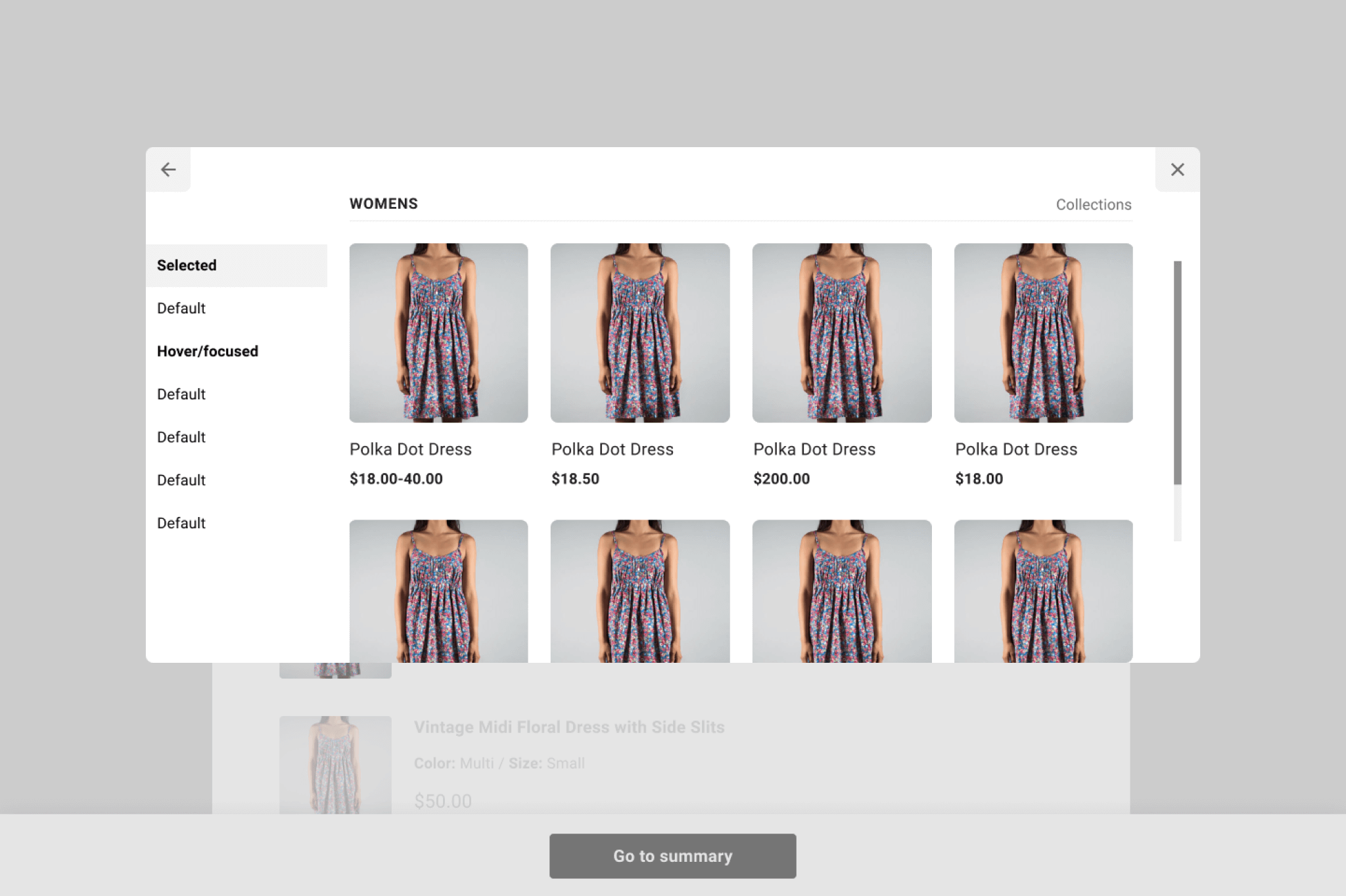
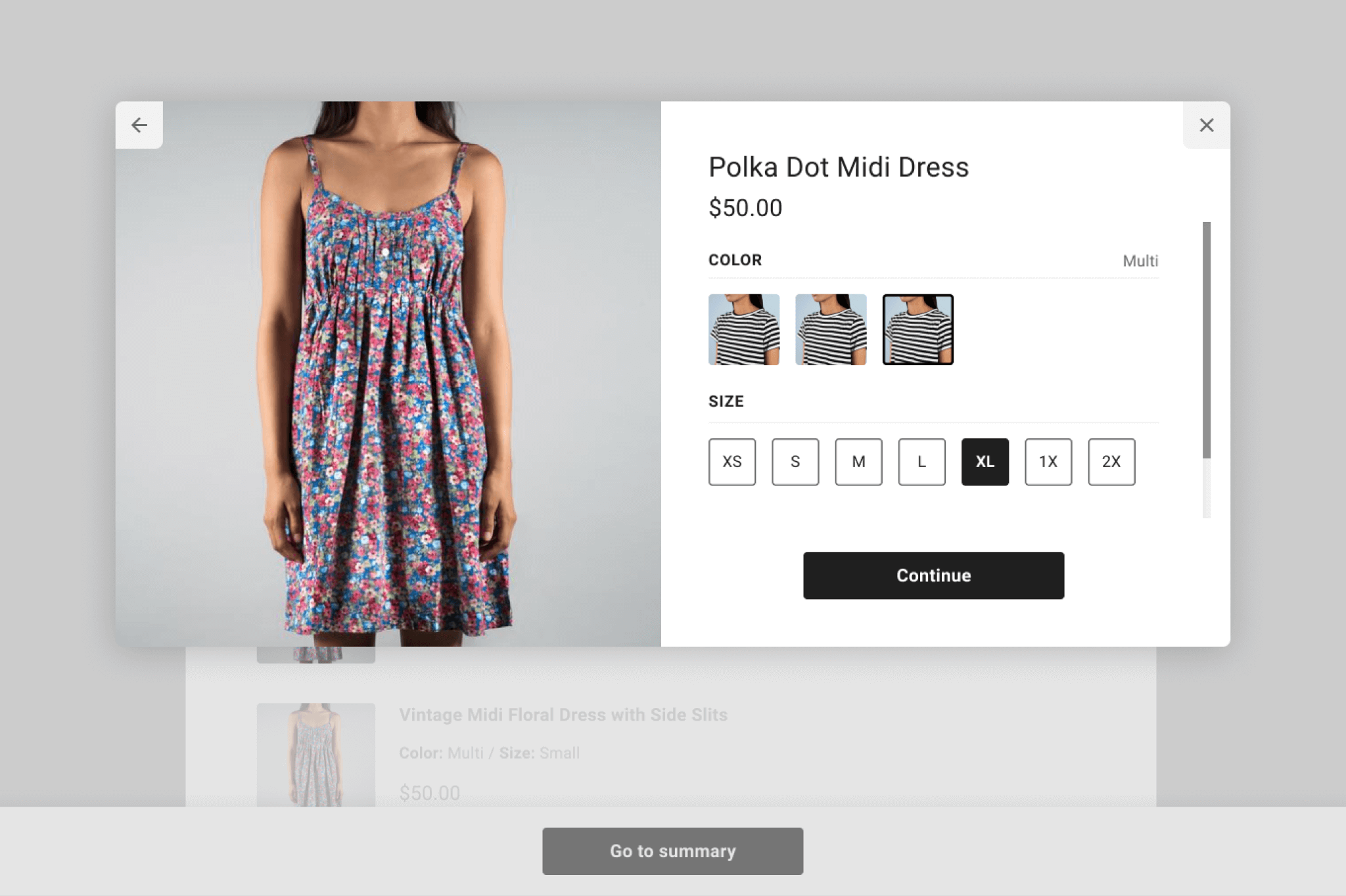
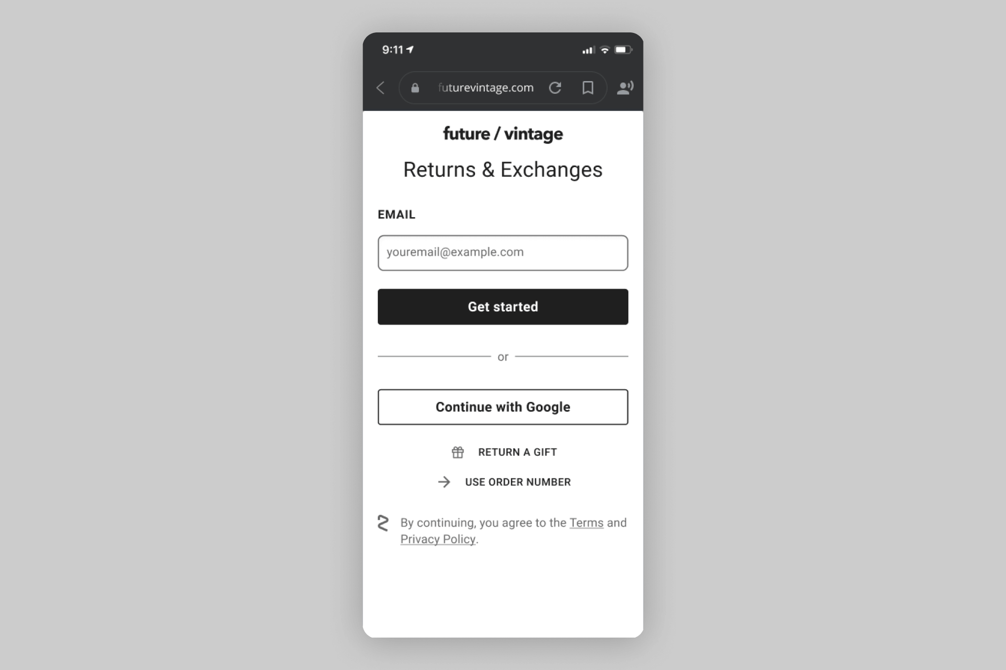
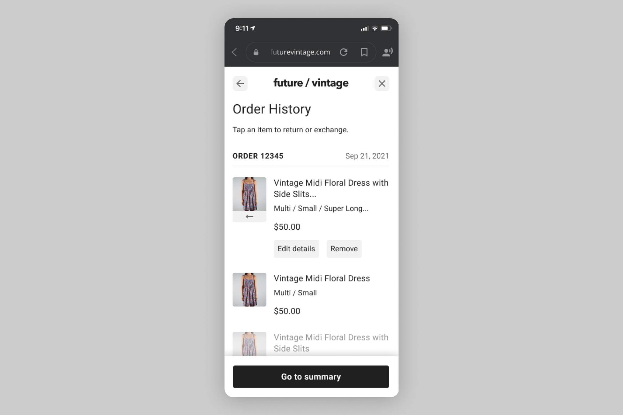
Next, with the information from our audit at hand, we proceeded with a few rounds of Visual Explorations. For the purpose of this exercise, we reimagined seven Key Pages from the Return Center. We picked pages that both showcased a wide range of design elements and challenges, as well as pages that were vital to the Return Center experience. In terms of establishing a design direction, I kept in mind that this was meant to be a blank slate that would come to feature a broad range of brands: I kept things as brand agnostic as possible and focused on general improvements like spacing, padding, visual hierarchy, typography, accessibility, and consistency.
Once we had some visuals to share, we organized a share out amongst the Product team and other cross-functional stakeholders to gather feedback, field questions, and foster alignment. The work on this project was well received, and we moved forward with producing the proposed components and design system. As our team expanded, I eventually shifted focus away from the design system and onto other projects, but remained involved.
DESKTOP DEFAULT STYLE EXPLORATIONS


MOBILE DEFAULT STYLE EXPLORATIONS
TYPOGRAPHY EXPLORATIONS
Creating a type scale for this project was especially interesting because we had so many customizable and variable elements. In addition to designing for mobile and desktop, we also allowed merchants to choose between using a default serif and default sans serif typeface. They could also customize the color of certain text elements, as well as buttons and links.
Originally, our default sans serif was Open Sans. We decided to research system defaults to replace this and landed on Roboto for Android, Segoe for Windows, and San Francisco for Mac OS/iPhone. For a default serif, we opted for Georgia.
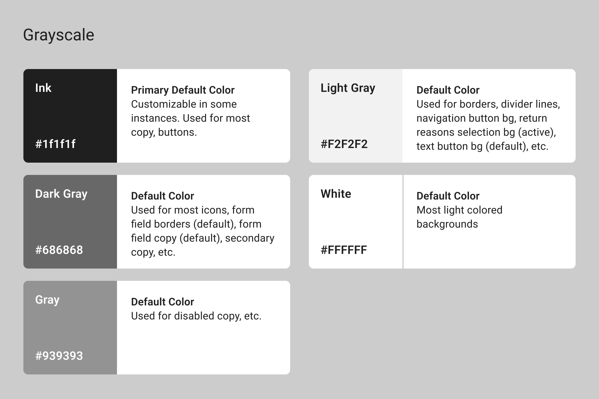
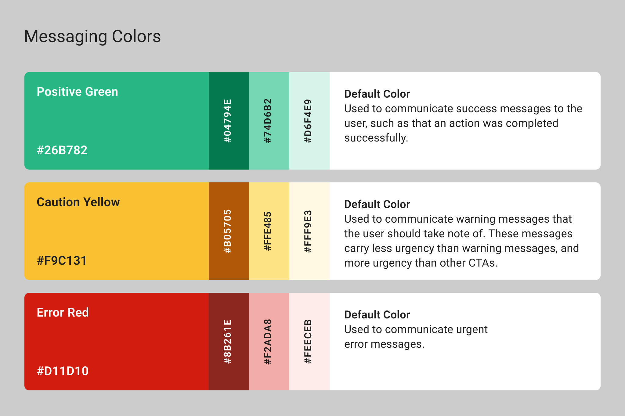
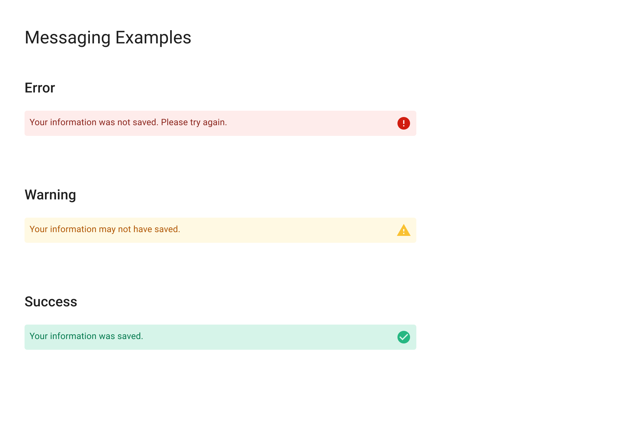
COLOR EXPLORATIONS
Since merchants would be customizing many of the colors in the Return Center, our job was to define default colors: colors that could be changed during customization, or colors that couldn’t be changed at all. To this end, I defined a flexible grayscale and also added a palette of success, error, and caution colors.
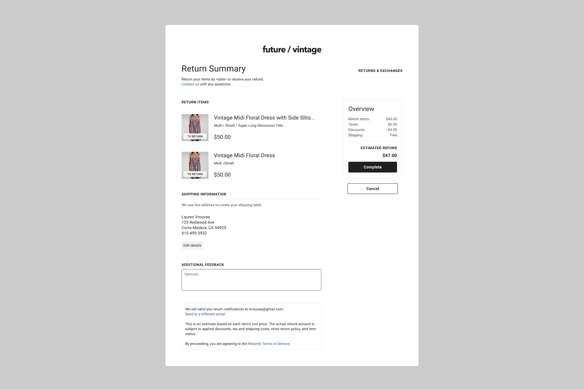
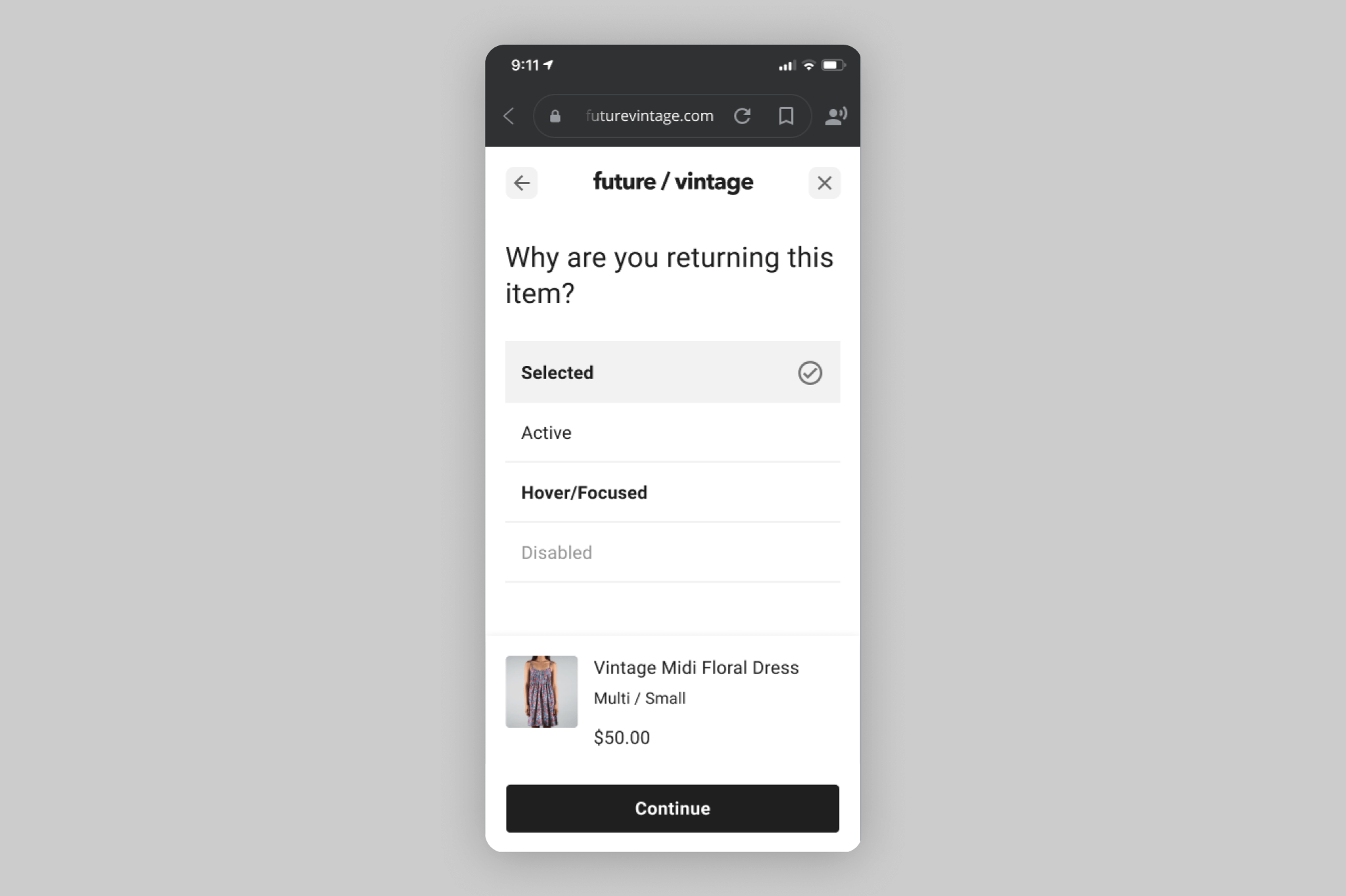
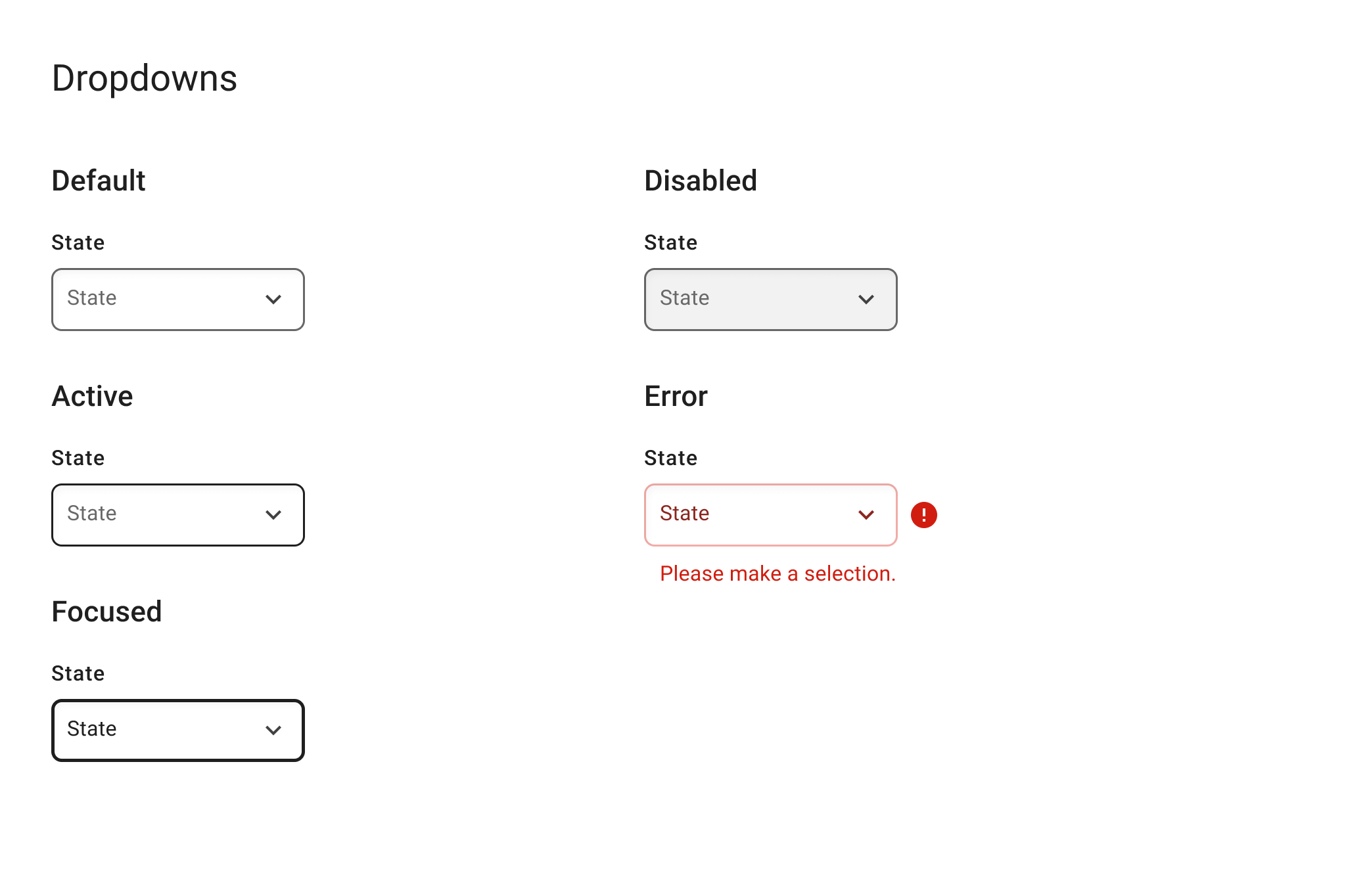
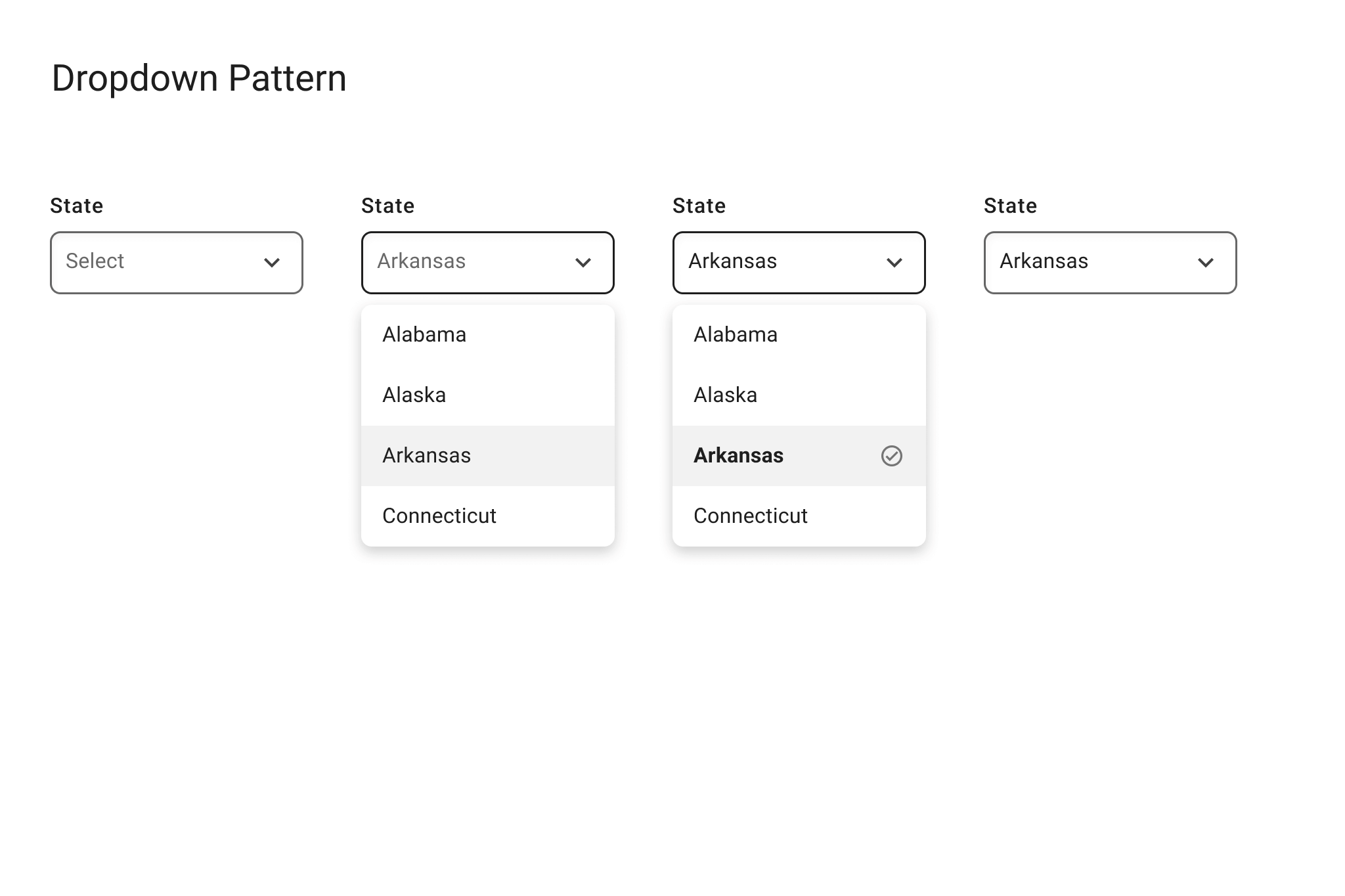
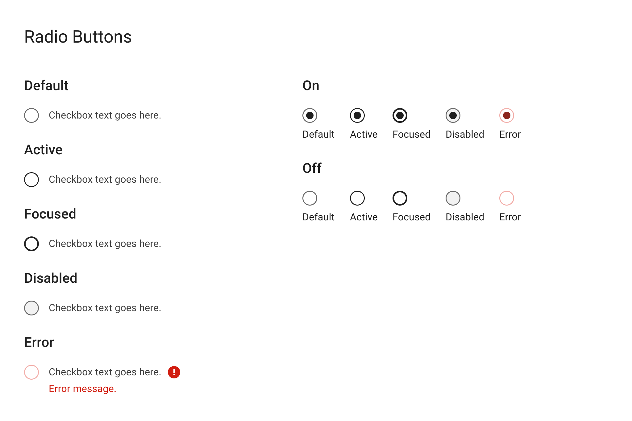
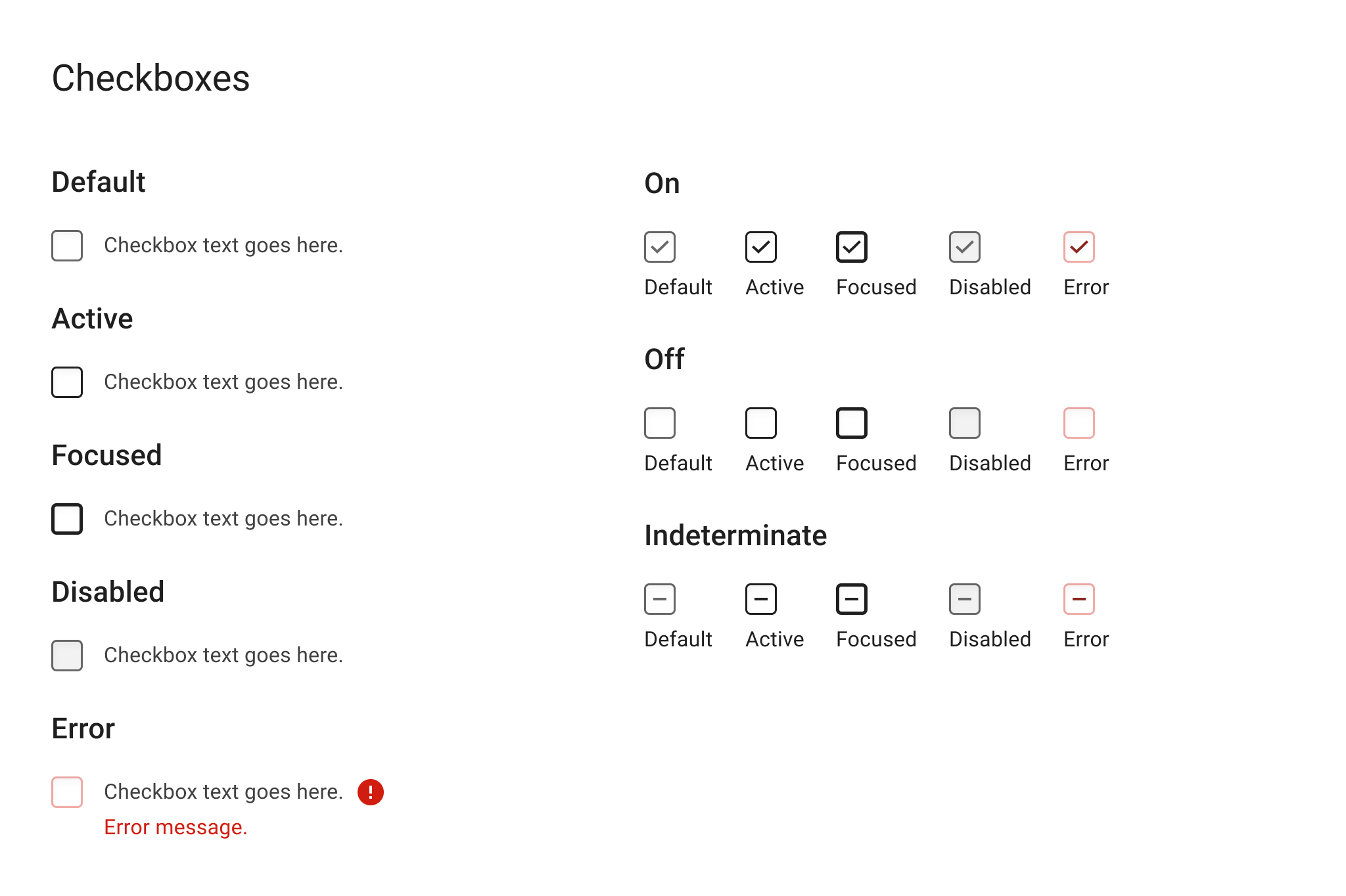
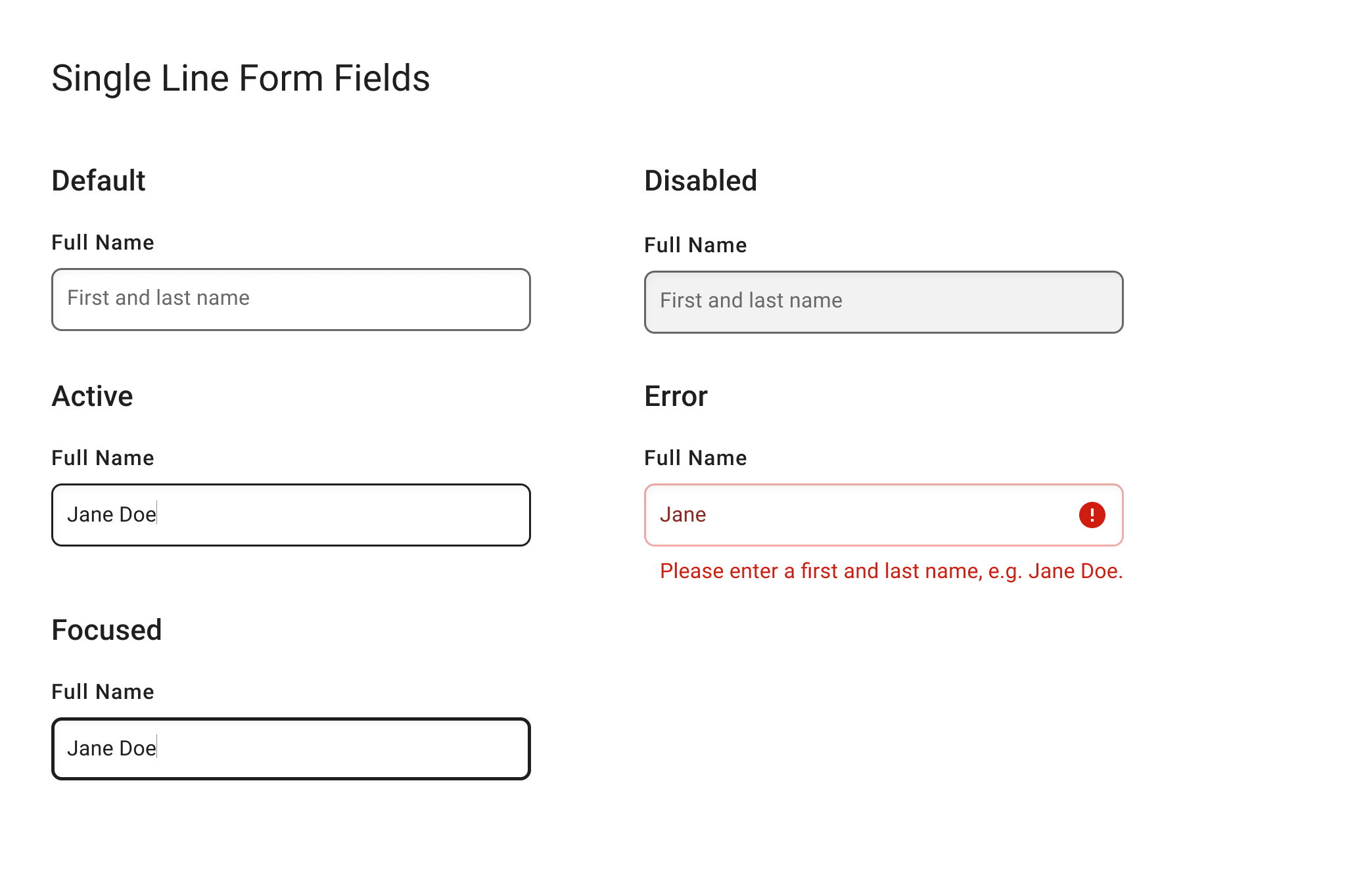
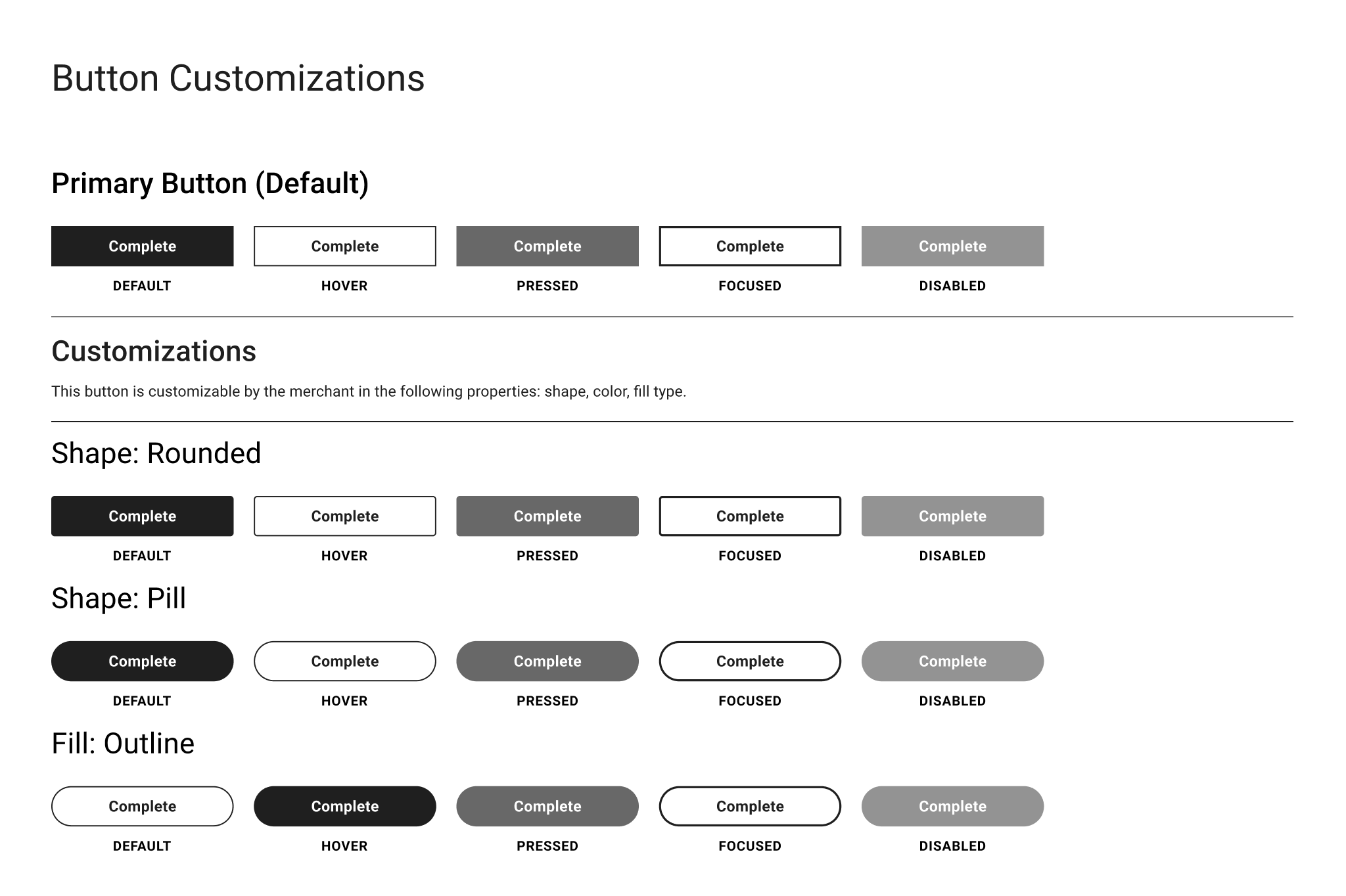
COMPONENT DESIGN
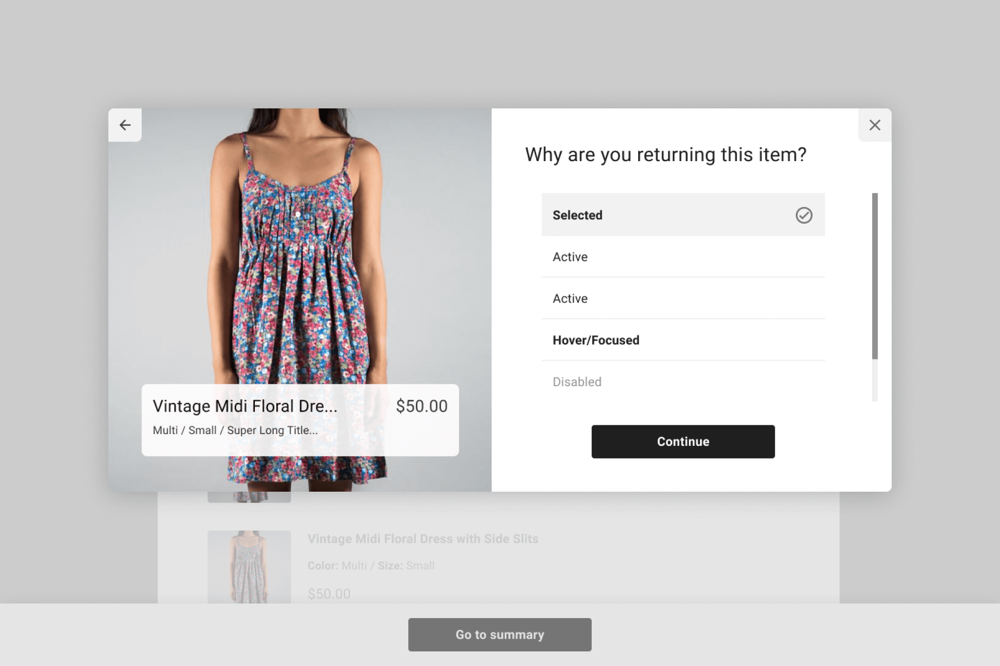
Here is a small sample of the components that we worked on. Buttons were especially fun to tackle, as they could be customized: they could be filled or outlined with custom colors, as well as take on squared, rounded, or curved edges. A notable improvement here was that previously, form field labels lived inside of the field; meaning that when you started typing, you could no longer see the label. Taking labels outside of the form field meant that the form fields took up a bit more space, but were easier to use.
OUTCOME
When it was time for implementation, we learned from Engineering that it would be an easier lift to create one unified design system between the Return Center and the Merchant Dashboard than to create two separate design systems for each surface area. This meant we had to ultimately had to make a few compromises on component design between both surface areas, and things sometimes changed quite a bit from our original proposals. Once we achieved alignment between our highest prioritized components, we continued to collaborate with Engineering to get them what they needed for handoff.
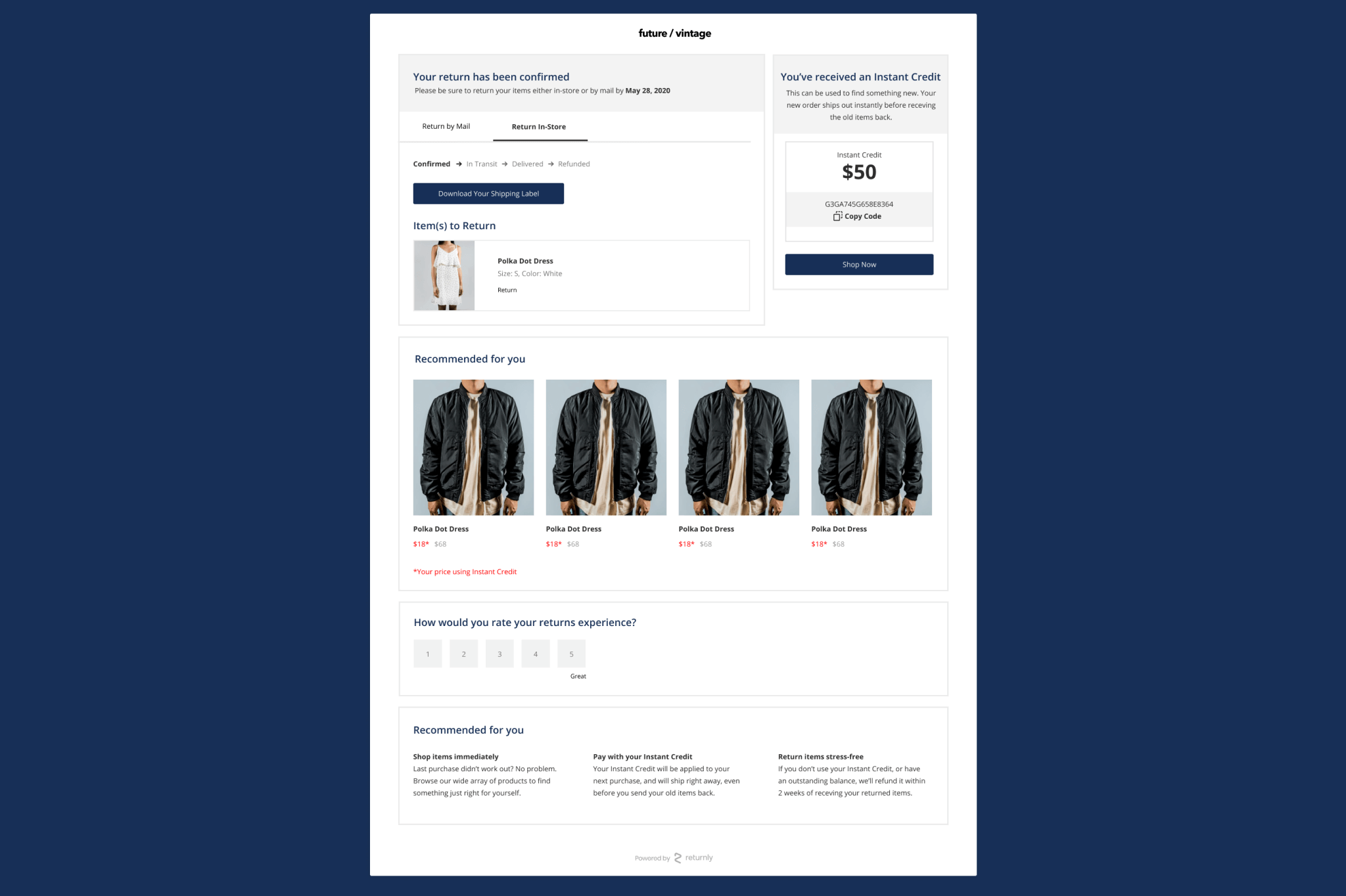
As we were nearly finished finalizing components for handoff, our project was paused due to rapidly shifting priorities within the company. However, we did get to see the new design system implemented live in one place: the Confirmation Page.