︎PROJECT:
︎ROLE:
RETURNLY CONFIRMATION
PAGE REDESIGN
︎ROLE:
BRAND DESIGN
VISUAL DESIGN
CONTEXT
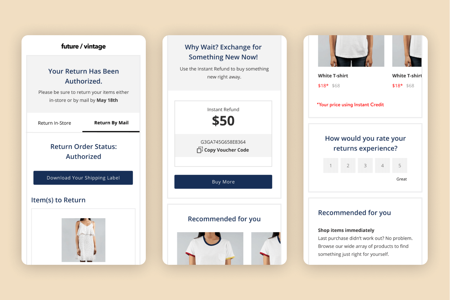
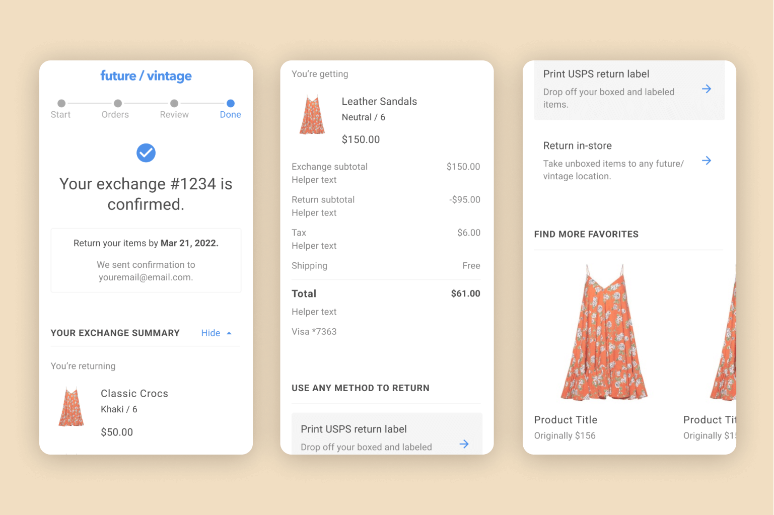
Returnly is a returns solution that allows shoppers to place a return order even before their return item is sent back and processed. Merchants who use Returnly have a customizable Return Center, through which shoppers submit returns and exchanges. The very last page of the Return Center Flow is the Confirmation Page, which lets the shopper know that their order is confirmed, gives a summary of their order, allows the shopper to download a shipping label, and gives return instructions.
GOALS
- Highlight Instant Credit
- Improve shopper comprehension of Instant Credit
- Bring more clarity to the returns experience for shoppers
EARLY MARKET INSIGHTS
- Previous UX Research studies showed that 7 of 9 shoppers did not understand the concept of Instant Credit
- UX Research indicated that next steps in the return process were unclear
PROCESS
This project was a huge team effort, and I was brought in after Product Design and Content Design had already done a significant amount of work. Essentially, they brought me their designs and I iterated on them before we started user testing. My aim was to keep things clear and focus on visual hierarchy, comprehension, and scanability.
CONFIRMATION PAGE


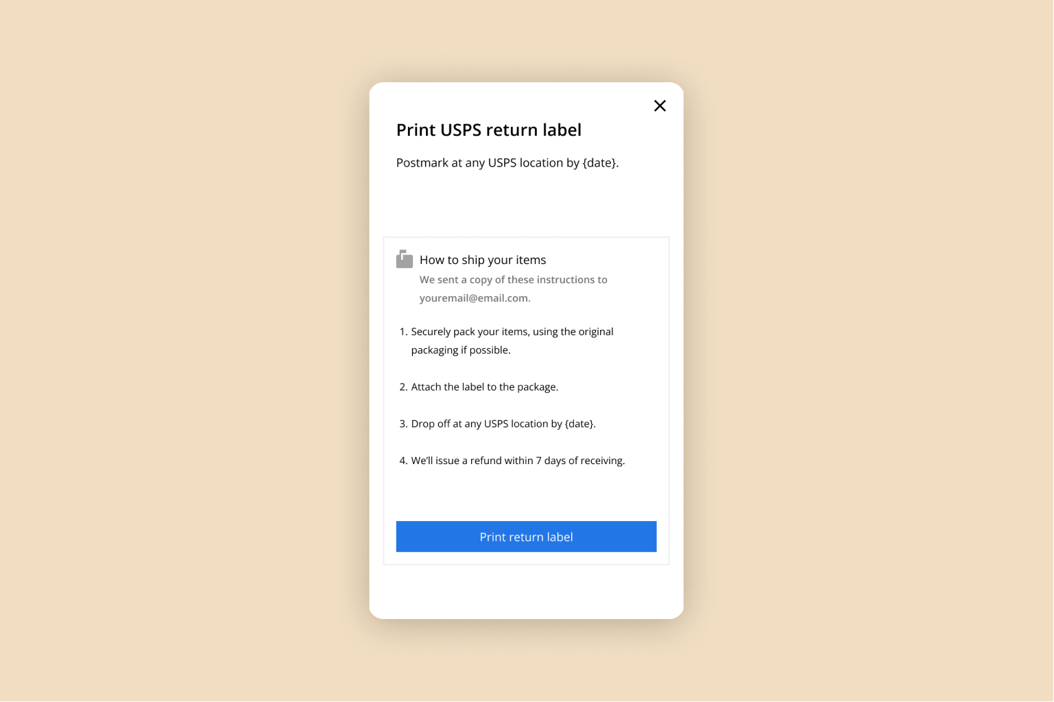
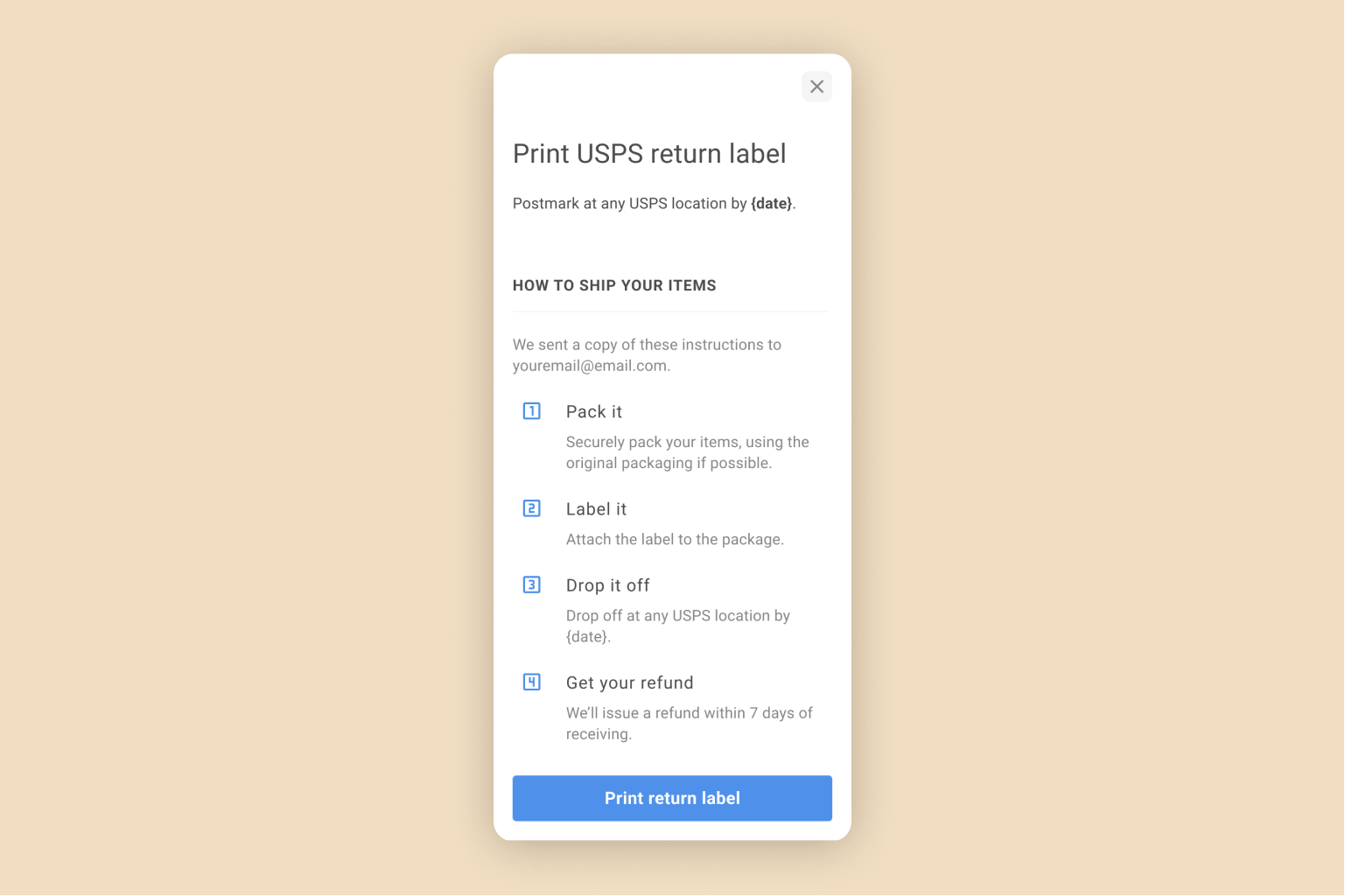
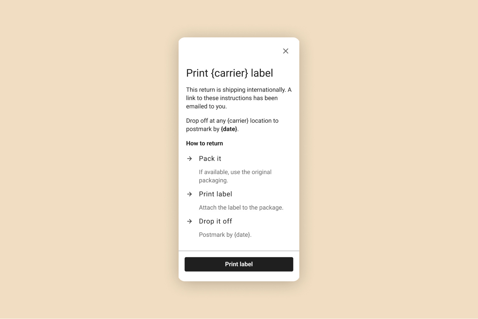
PRINT LABEL MODAL
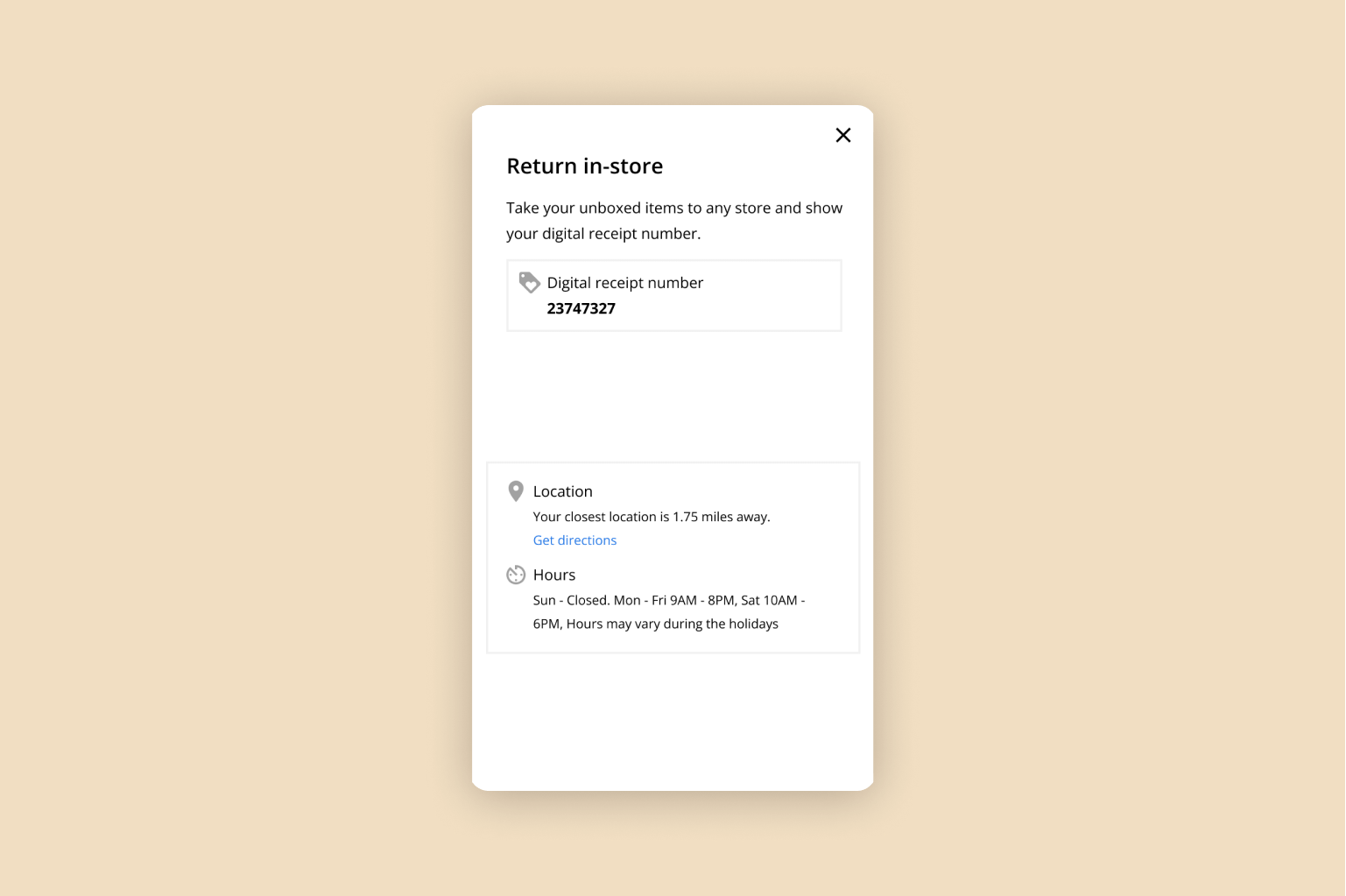
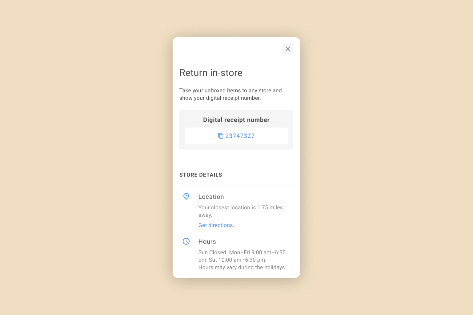
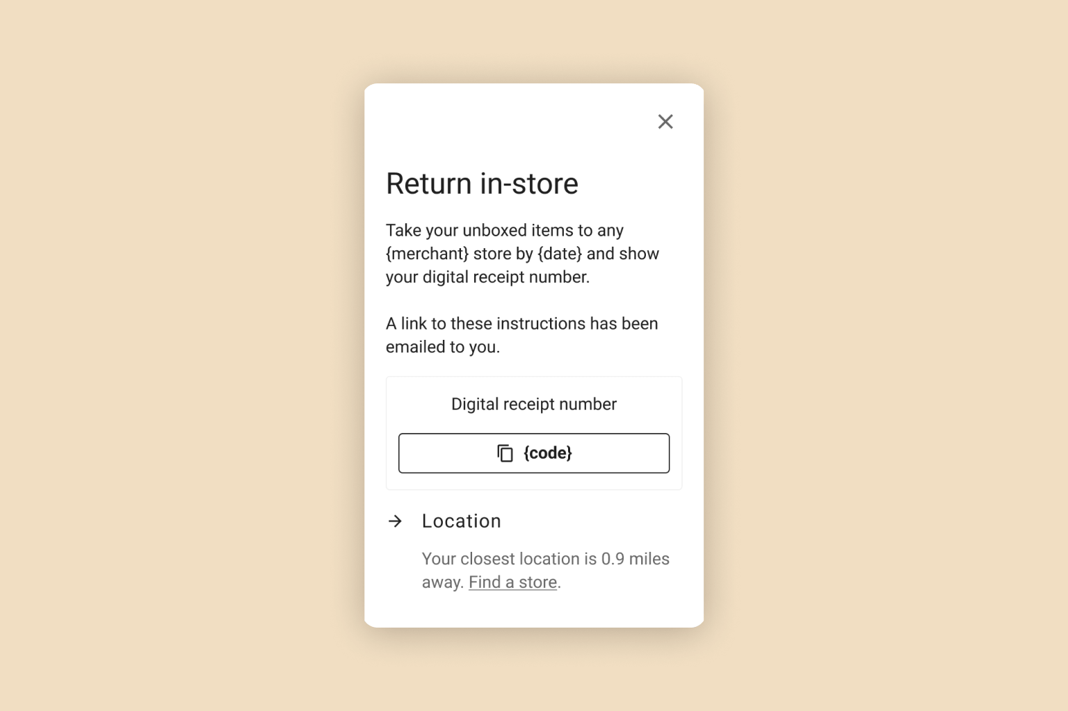
RETURN MODAL
OUTCOME
The Confirmation Page Redesign was a massive success. The Confirmation Page redesign saw an approximate 20-25% increase in repurchase rate, with an increase of 6% in value for those repurchases. Repurchase rate was five times higher for shoppers who clicked into the “what’s this?” modal. Translated to revenue retention, this amounts up to a 30% relative increase in retention. If rolled out to all merchants, this could increase the FinTech revenue for Returnly by 10%, meaning an approximate 4-5% increase in overall net revenue.