︎PROJECT:
︎ROLE:
RETURNLY MERCHANT
DASHBOARD REDESIGN
︎ROLE:
BRAND DESIGN
VISUAL DESIGN
CONTEXT
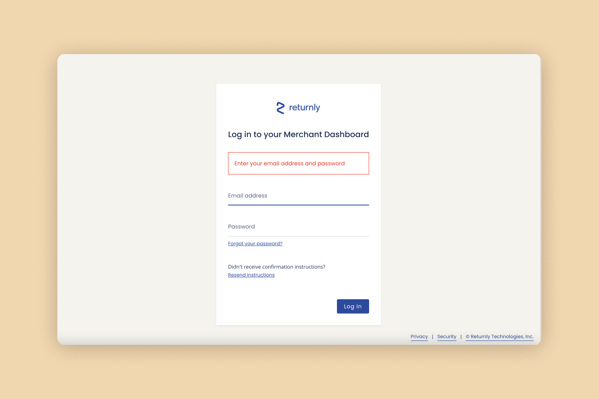
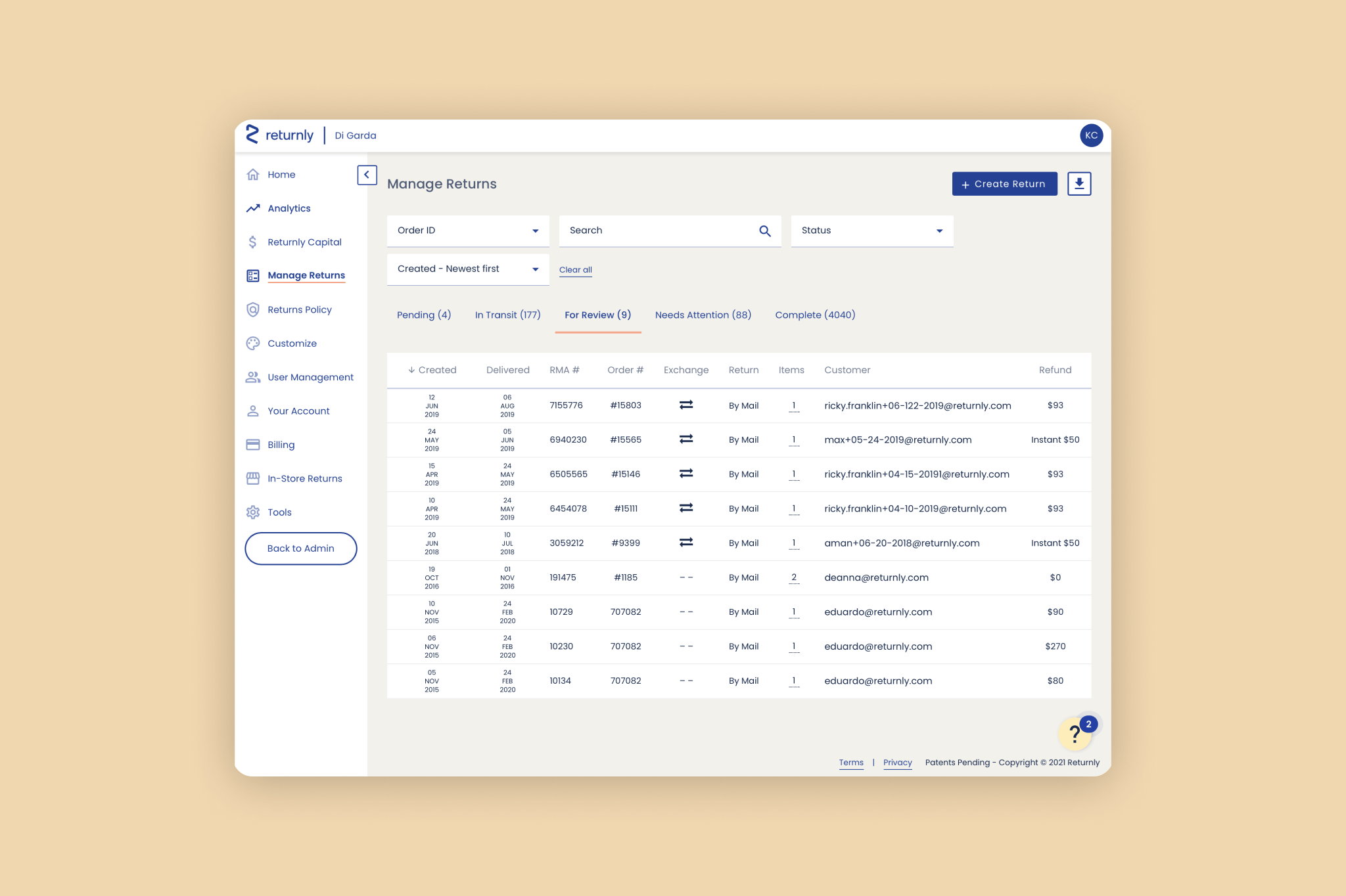
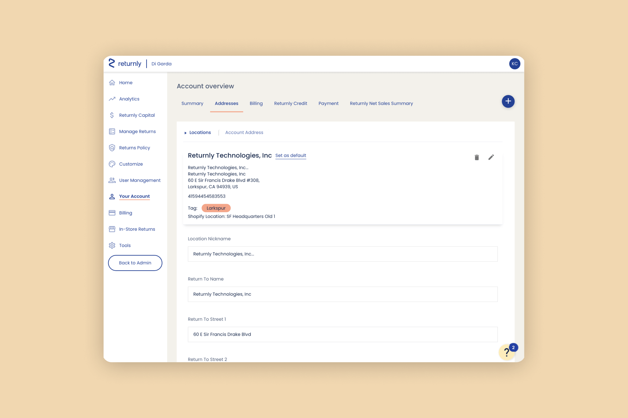
Returnly is a returns management solution that allows shoppers to place a return order even before their original return is received and processed by the merchant. Merchants who use Returnly interact with the product primarily through the Merchant Dashboard, where users can manage returns and exchanges, customize what their shopper-facing Return Center looks like, manage their account, view analytics, and more. The Merchant Dashboard cannot be viewed by shoppers — it’s for merchant eyes only.
PROBLEM
The existing Merchant Dashboard had a few key issues we wanted to address:
- It wasn’t an accurate reflection of the brand; aside from using our brand colors and one of our brand typefaces, the dashboard felt relatively sterile, and didn’t feel as carefully considered as some of our competitors’ dashboards
- It didn’t always follow best practices in readability
- It didn’t always follow best practices in accessibility
- It didn’t always make sense in terms of visual hierarchy
In summary, the dashboard functioned, but it could be a better, more accessible, and more intentional experience.

GOALS
Specifically, our goals were to:
- Produce a directional set of mocks that would align R&D and Marketing for future direction
- Update the current design system with new high confidence components (documented in Figma)
- Align on a prioritized set of components and timing for Product and Eng implementation
Broadly, our goals were to:
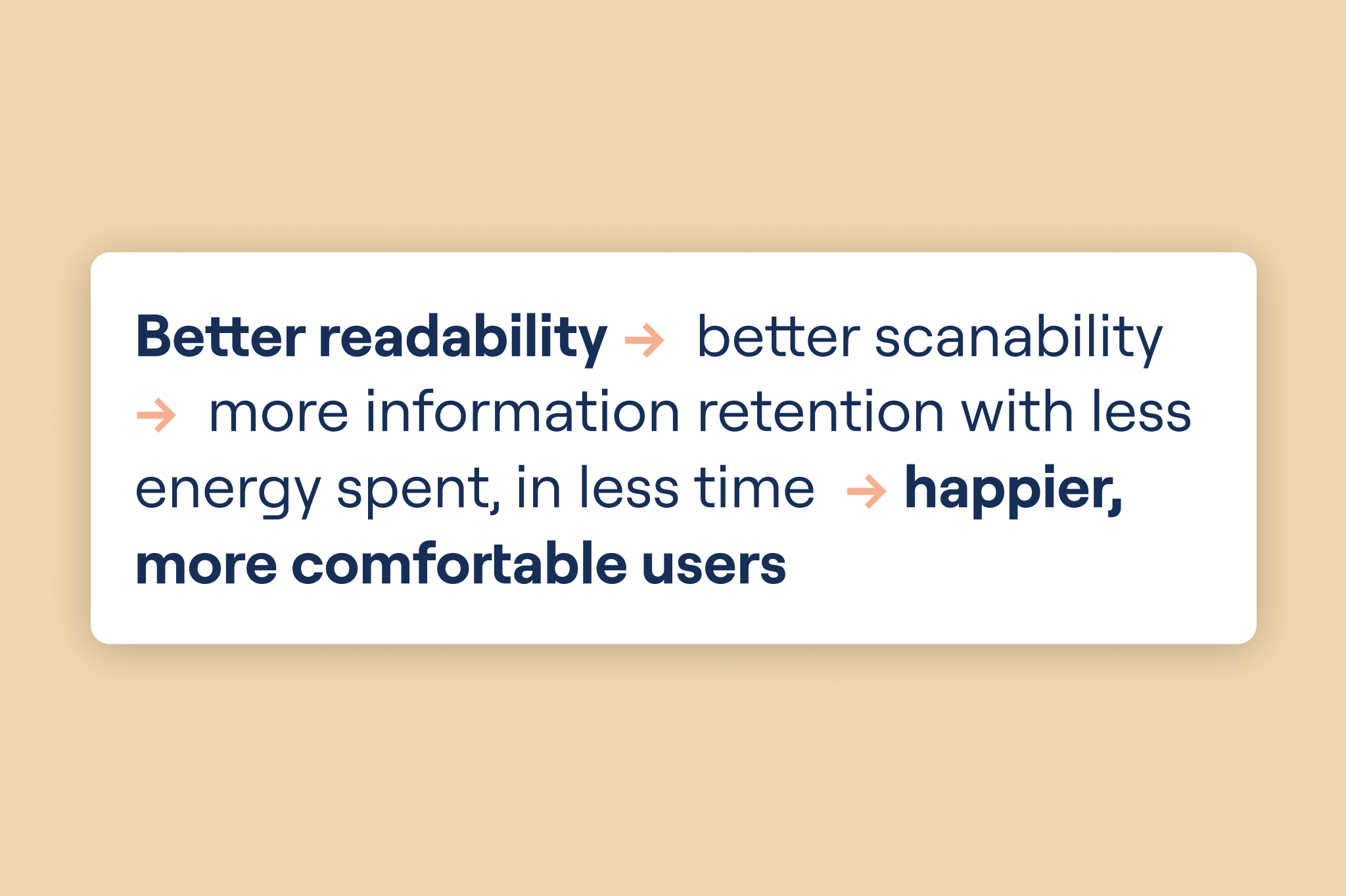
- Improve readability of the dashboard
- Improve visual hierarchy of the dashboard
- Improve overall look and feel of the dashboard
- Bridge the gap between brand and product within the dashboard
CONSTRAINTS
- Use existing brand assets and guidelines
- Use the existing Merchant Dashboard as “functional wireframes”, focusing explorations on four key screens, chosen to showcase a range of design elements and challenges
- Keep functional changes to a minimum
PROCESS
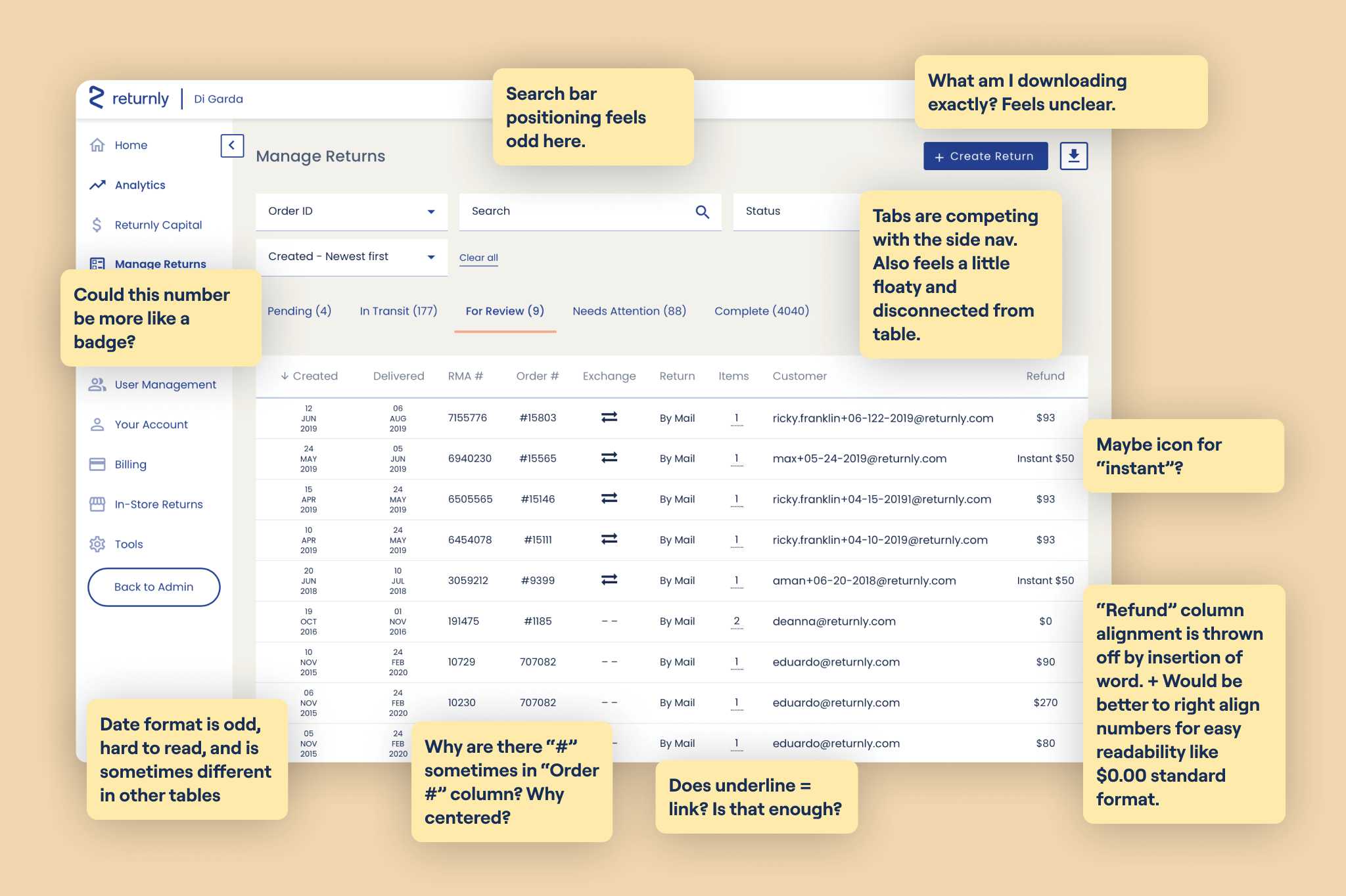
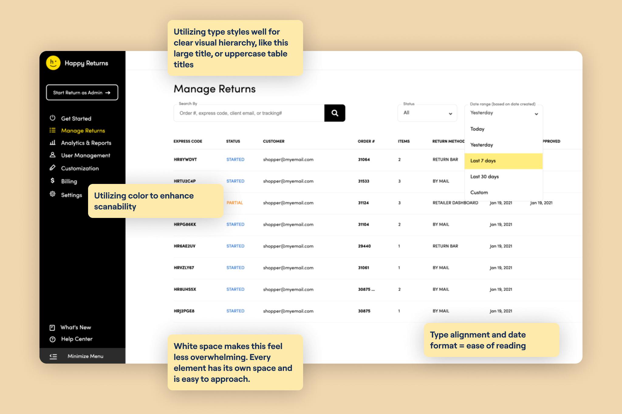
The most crucial key to success in this project was to get buy in from our stakeholders, and in order to do that we needed to make sure everyone was aligned on why some of the design decisions we were pushing for were worth the time and effort it would take to implement the changes we were suggesting. Bearing this in mind, our first step was to do a Competitive Audit: a visual audit of our dashboard, in comparison to our competitors’ dashboards, as well as a few general best in class examples.
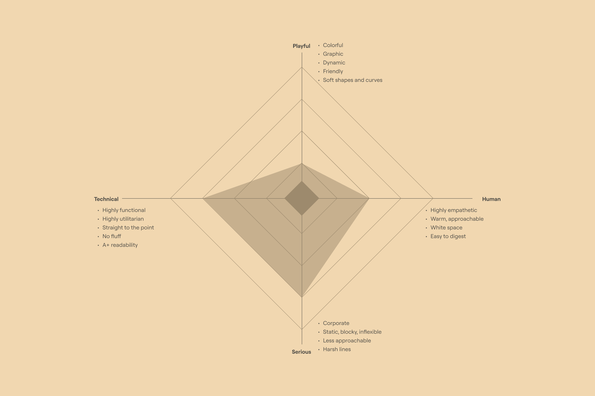
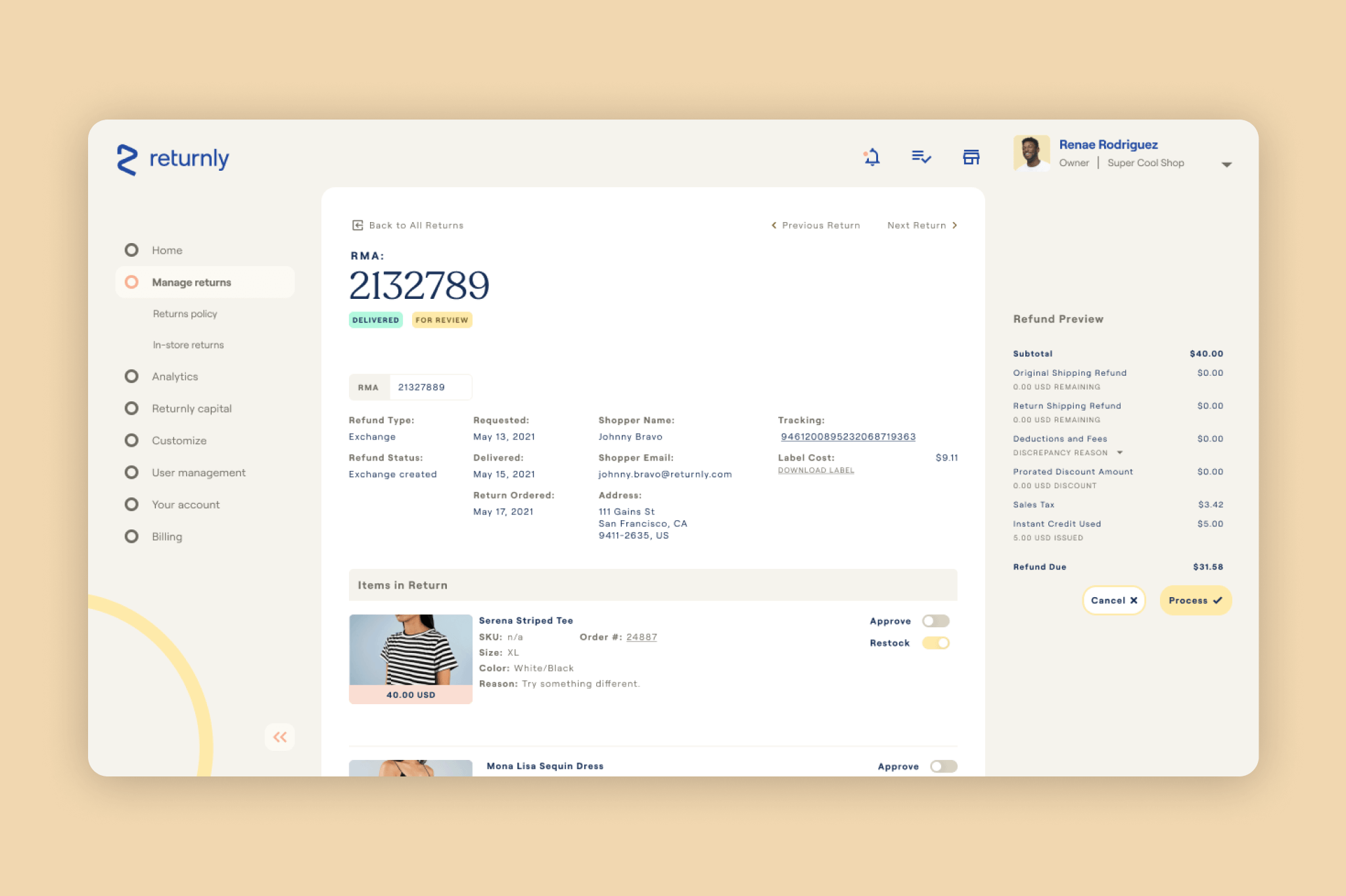
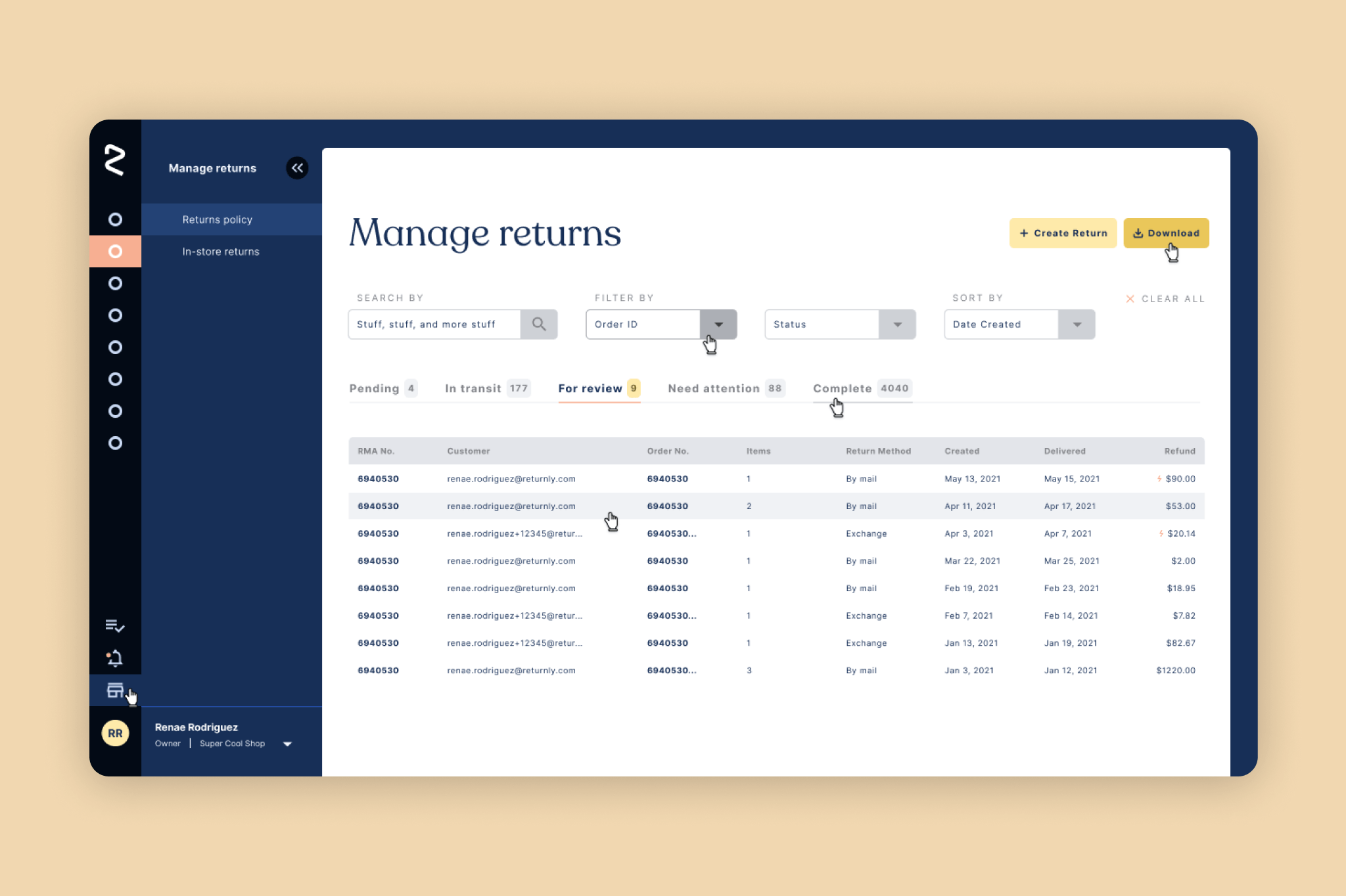
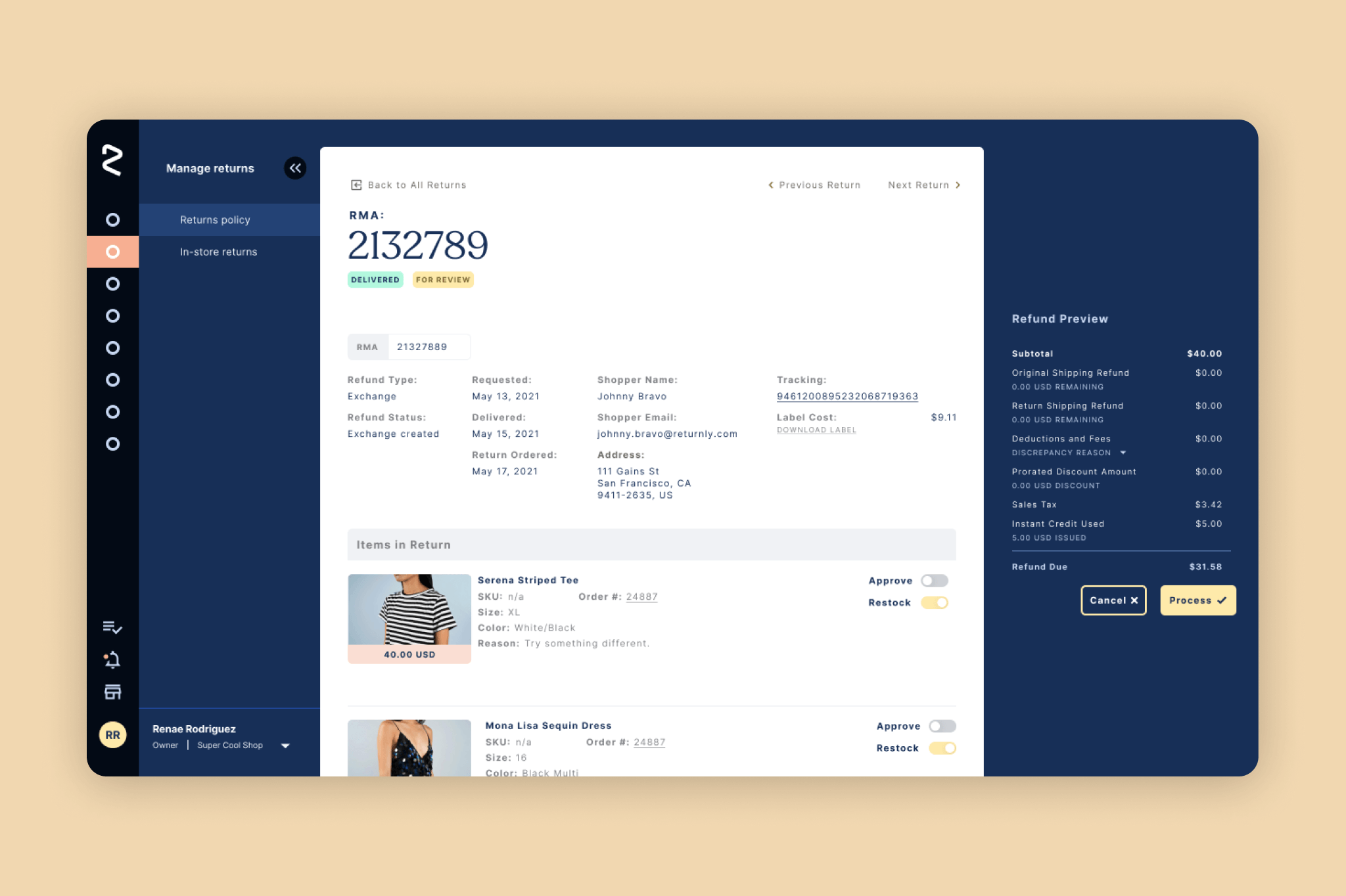
Next, based on the information from our audit, we proceeded with a few rounds of Visual Explorations. For the purpose of this exercise, we reimagined four Key Pages from the Merchant Dashboard. We picked pages that both showcased a wide range of design elements and challenges, as well as pages that were vital to the Merchant Dashboard experience. We based the direction of our Visual Explorations on four simple Polarities: Playful vs. Serious and Technical vs. Human.
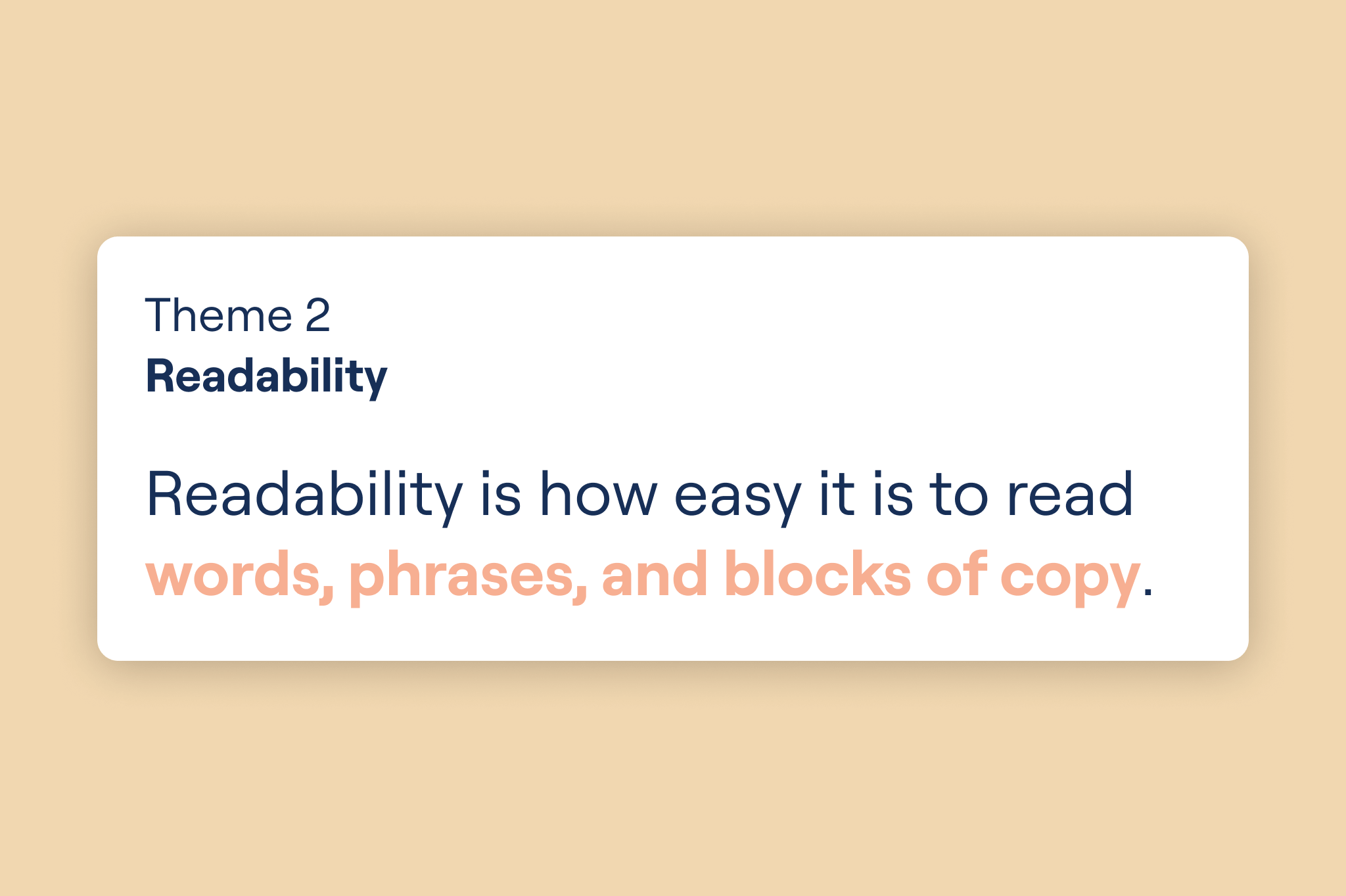
Once we had some visuals to share, it was time to test the waters and organize a share out amongst the Product team and other cross-functional stakeholders. As previously mentioned, it was critical that stakeholders understood the impact of the design decisions we were advocating for, so we decided to include some light design education in our presentation as well. After presenting the goals and scope of the project, we shared our Competitive Audit broken down into four themes: visual hierarchy, readability, cohesion, and brand voice. We first explained what each theme was, why it mattered, identified our areas of greatest opportunity, and then compared our current performance in that theme to our competitors’.
The work was very well received; Marketing was excited to have more brand presence within the product, Product and Engineering understood why this work was important and were excited to work on it, and even our CEO was excited to see where this project would ultimately lead.
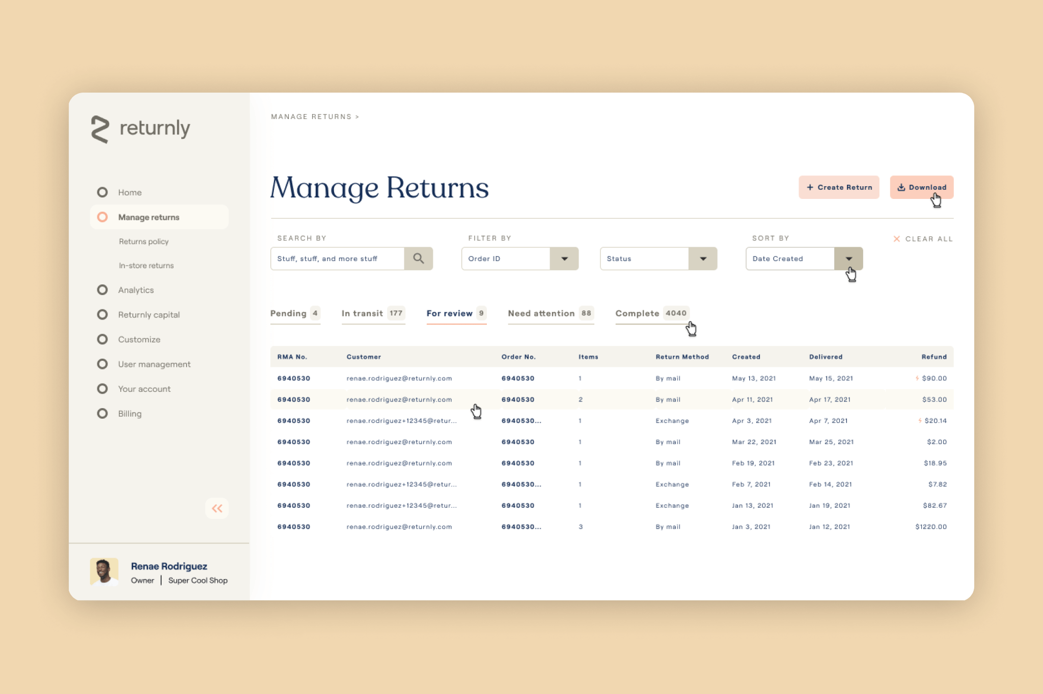
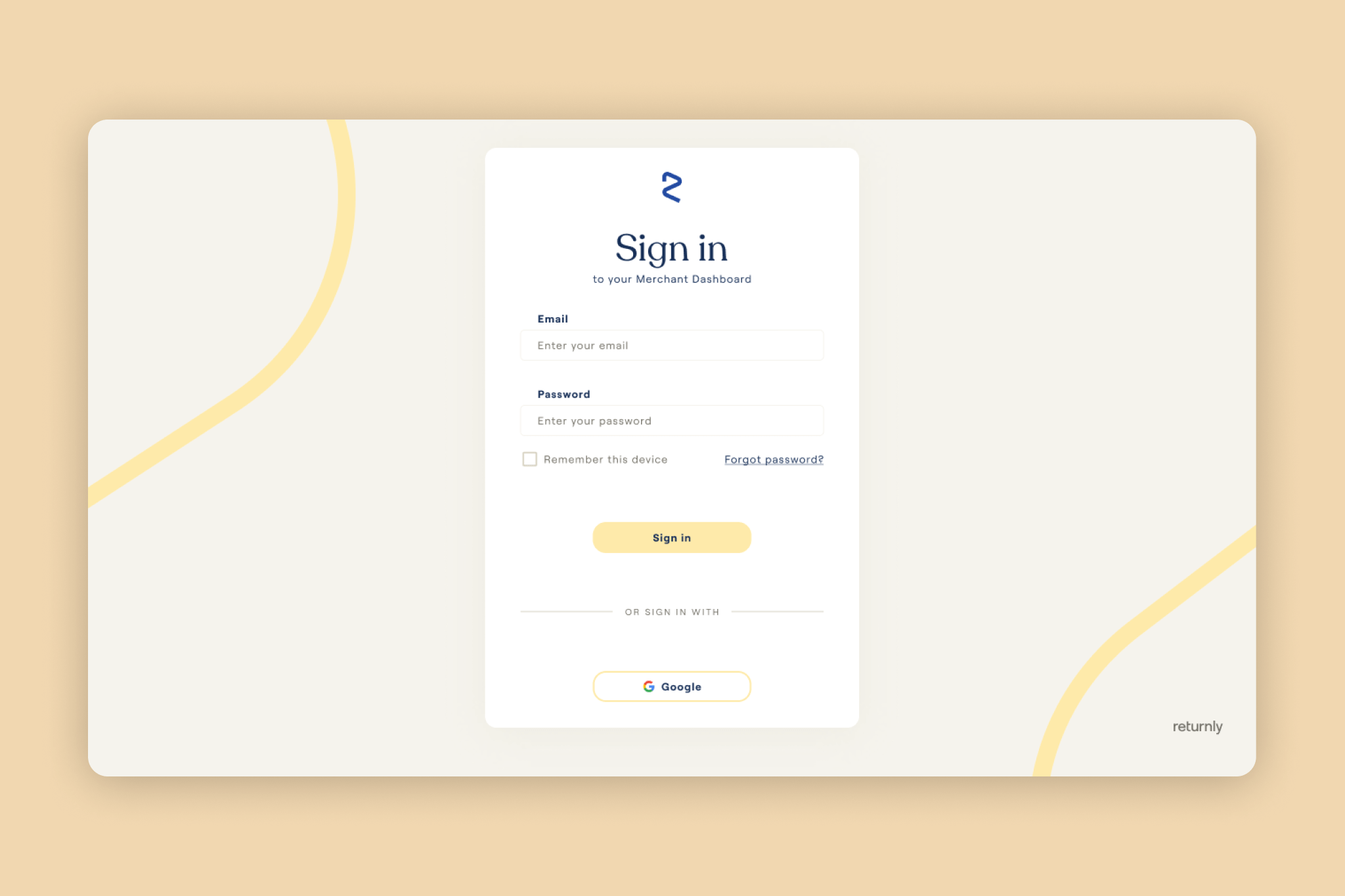
EXPLORATION ONE
Slightly playful. Very serious. Somewhat human. Very technical.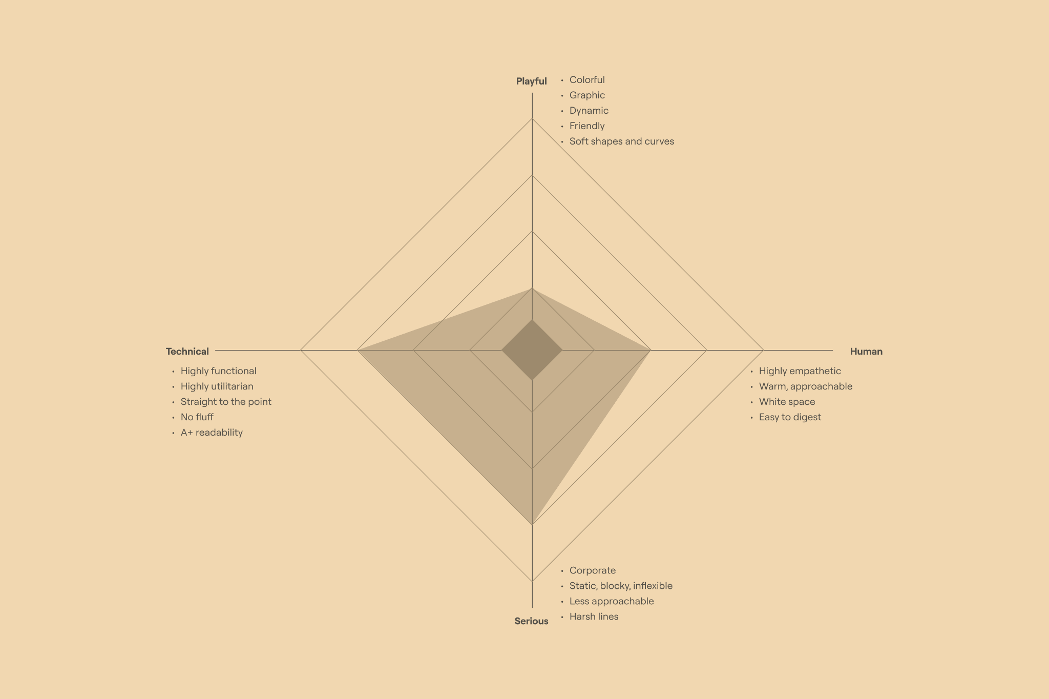


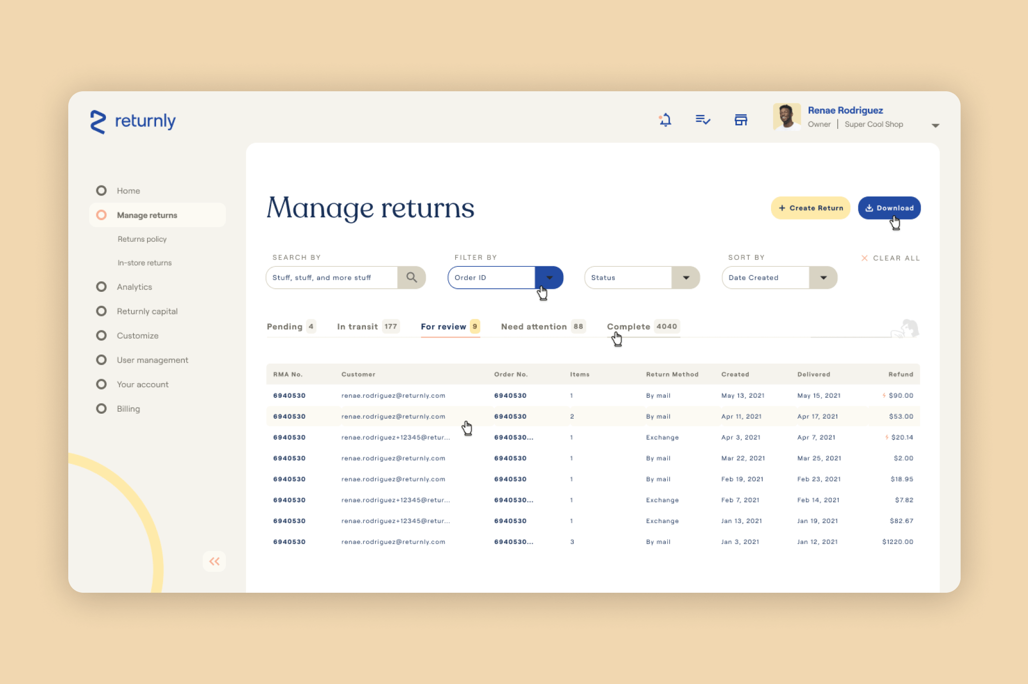
EXPLORATION TWO
Very playful. Somewhat serious. Extremely human. Somewhat technical.
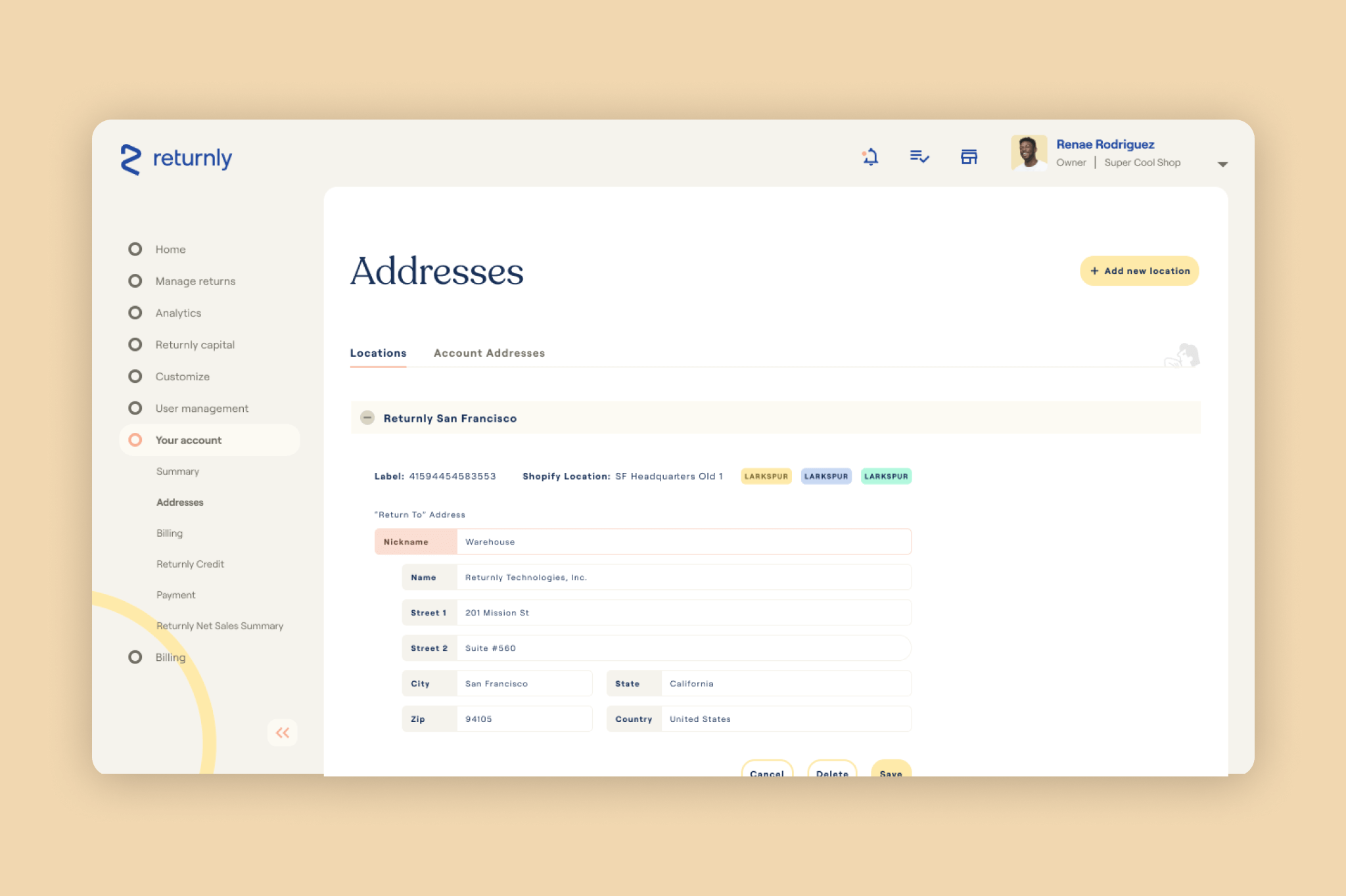
EXPLORATION THREE
Slightly playful. Very serious. Extremely human. Somewhat technical.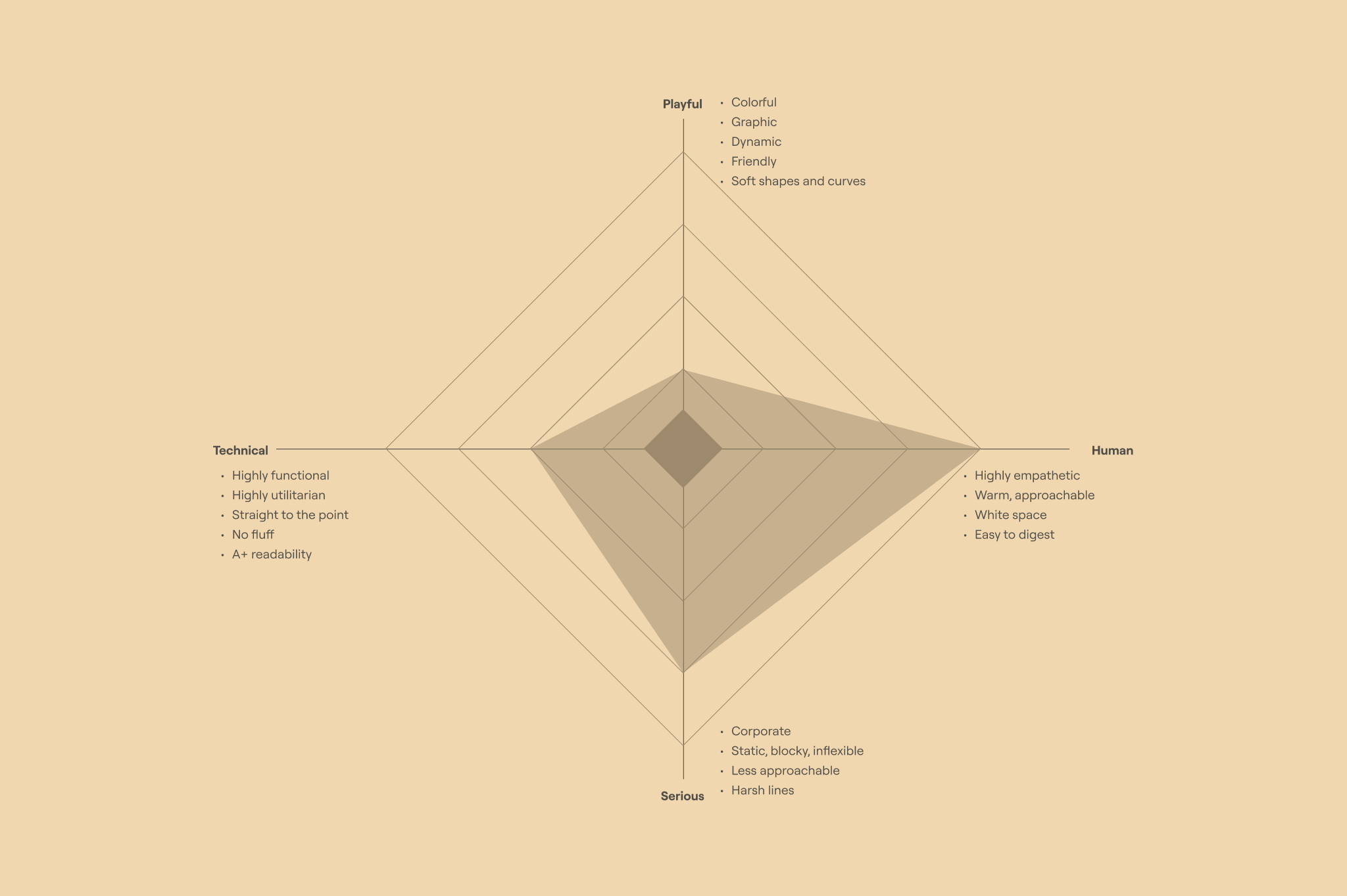


OUTCOME
Ultimately, the work was received very well, and everyone involved was excited about making improvements to the product. However, after Returnly was acquired by Affirm, shifting priorities within the company and engineering constraints led to the project being paused indefinitely. While this was unfortunate, we were still able to use this work as inspiration in future projects.
TAKEAWAYS
This was one of my very first product-related design projects, so there are quite a few things I would have done differently if I was tackling this project today. I think it would have been helpful to show an option that had less aggressive changes, just to give an idea of what could be accomplished with a simple reskin of the existing dashboard. I also think the polarities I used could have used more fine-tuning, and may have felt a bit biased (e.g. comparing “human” with “technical” makes “technical” seem inherently negative). Overall though, I learned a lot from this project, and I’m very happy to have had the opportunity to lead it.